

Imagine walking into a room that instantly lifts your mood, sparks creativity, and reflects your unique personality. That’s the transformative power of bold color combos. Gone are the days of playing it safe with neutral tones—today’s interior design celebrates vibrant, daring palettes that make a statement and breathe life into any space. Whether you’re refreshing a single room or overhauling your entire home, embracing bold colors can elevate your decor from ordinary to extraordinary. This article explores why these combinations matter more than ever in modern home design. We live in colorful times where self-expression through our surroundings has become a priority. Bold color combos aren’t just about aesthetics—they influence how we feel, think, and interact within our homes. Research shows that certain colors can boost energy, promote relaxation, or stimulate conversation. By thoughtfully combining hues, you create visual interest and depth that monochromatic schemes simply can’t achieve. We’ll guide you through eight revolutionary palettes that balance drama with sophistication. From living rooms that welcome with warmth to bedrooms that soothe with serene contrasts, these combinations prove that bold doesn’t have to mean overwhelming. Get ready to discover how to use color confidently, creating spaces that truly feel like home while making a lasting impression on everyone who enters.
Essential Bold Color Combos for Every Room
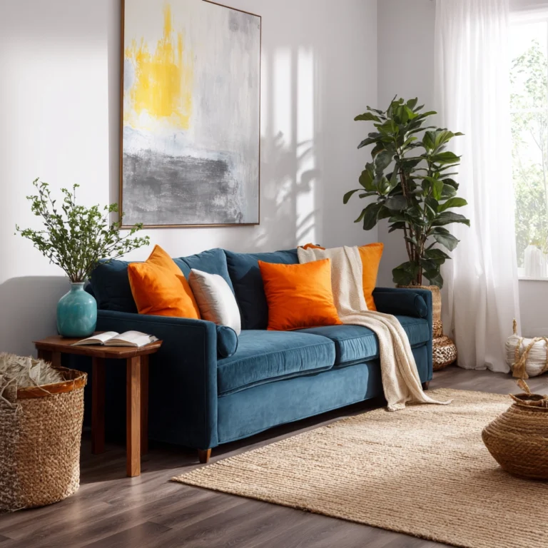
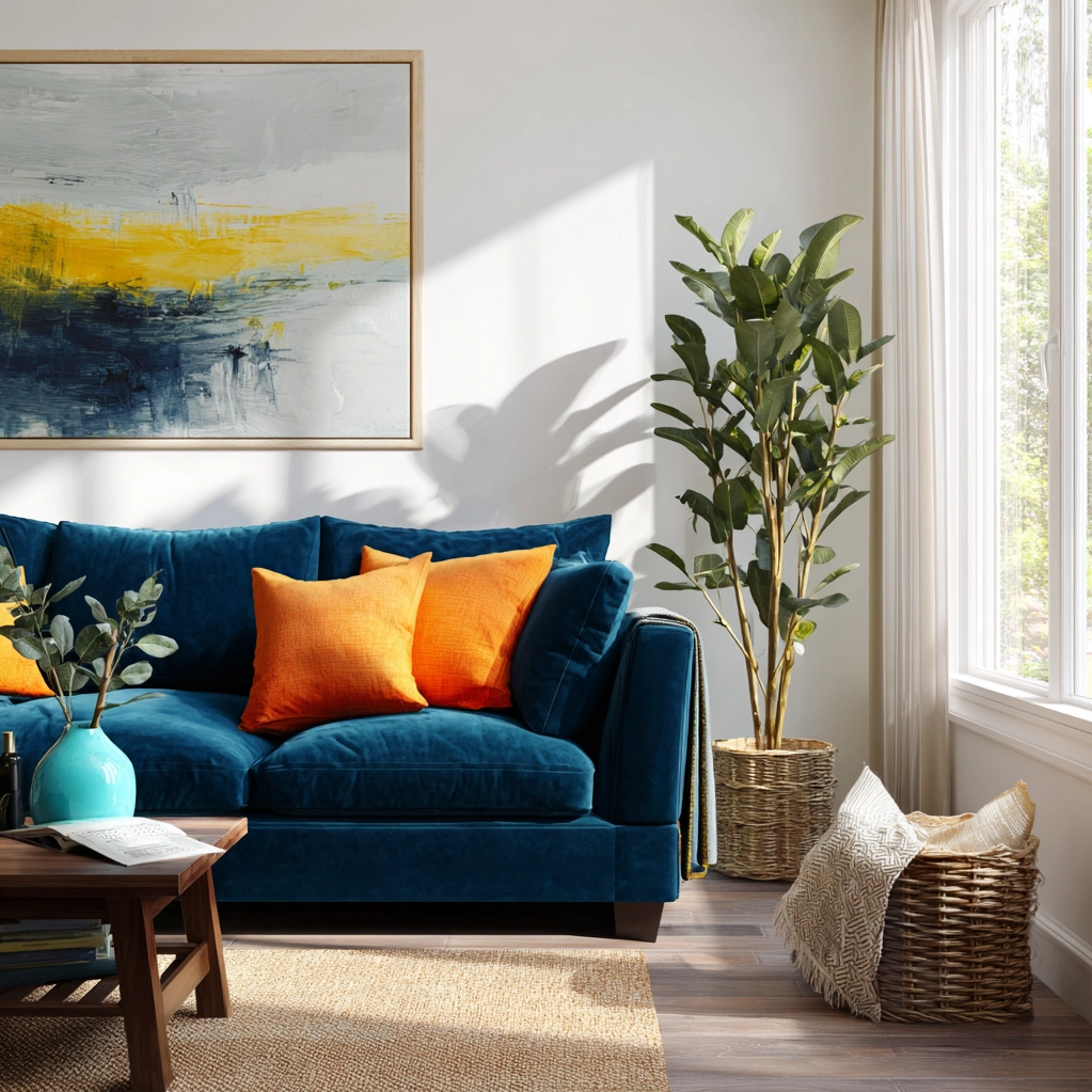
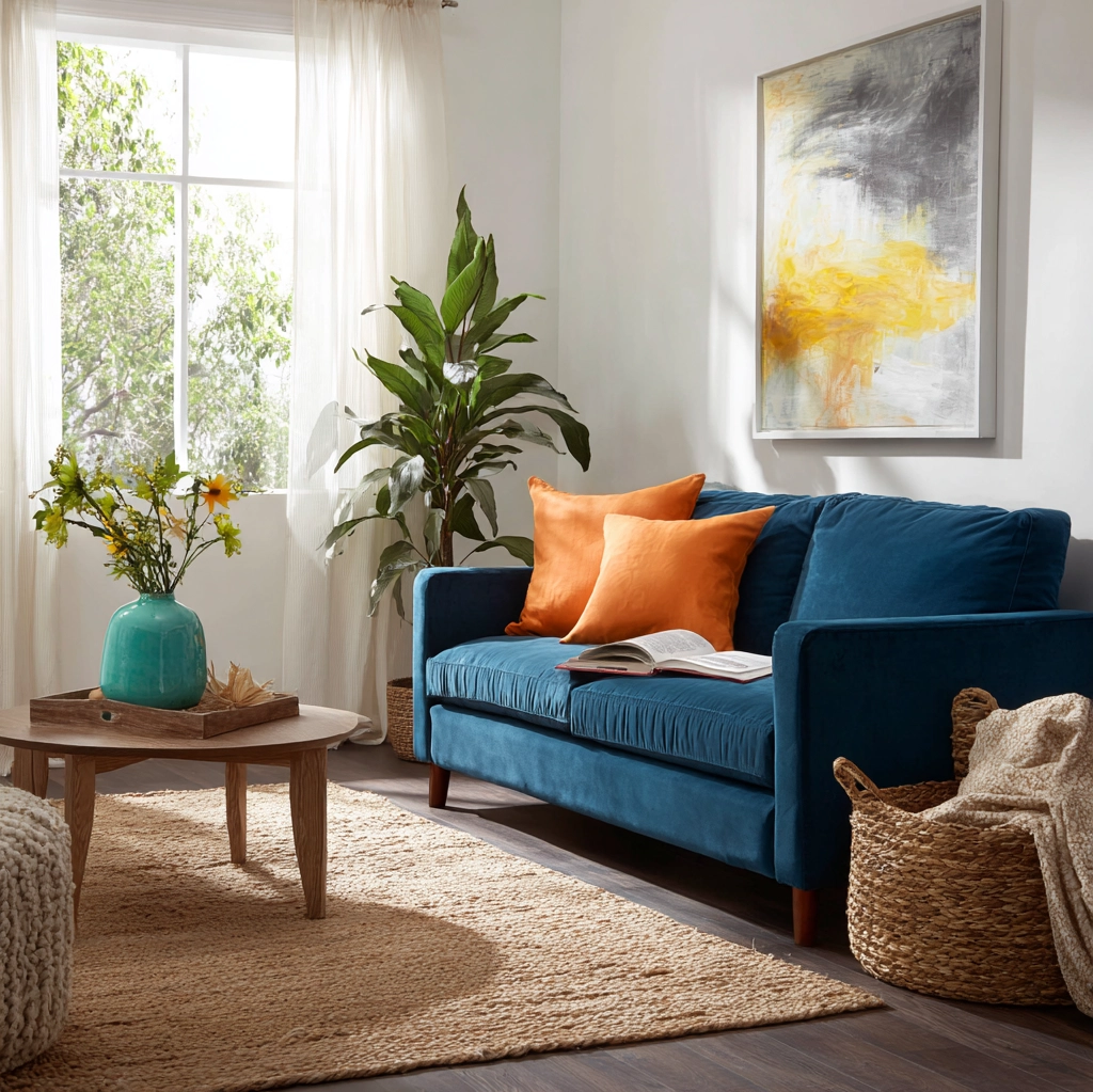
Choosing the right bold color combos starts with understanding how different spaces function. For living areas, consider dynamic pairings like deep navy with burnt orange. This combination creates a cozy yet sophisticated atmosphere perfect for entertaining or relaxing. Navy provides a rich, grounding base while orange adds warmth and energy. In bedrooms, bold doesn't have to mean bright. Try emerald green with soft blush pink for a serene retreat. Green promotes relaxation while pink introduces gentle contrast. Kitchens benefit from high-energy combos like sunshine yellow and charcoal gray. Yellow stimulates appetite and conversation, balanced by gray's modern edge. Home offices thrive with focus-enhancing palettes. Teal and mustard yellow work wonders here. Teal encourages concentration while yellow sparks creativity. Don't forget entryways—your home's first impression. A striking combo like crimson red and crisp white makes a memorable statement. Red commands attention while white keeps it fresh. Each room has unique needs, but all benefit from carefully chosen bold color combos. Balance is key. Pair one dominant color with one or two accents. Use the 60-30-10 rule: 60% dominant color, 30% secondary, 10% accent. This creates harmony without chaos. Test colors in your space at different times of day. Natural light changes how colors appear. Sample paints on large boards before committing. Remember, bold color combos should enhance your life, not overwhelm it. Start with one focal wall if you're hesitant. You can always expand once you love the results.
How to Balance Bold Color Combos with Neutrals
The secret to successful bold color combos lies in strategic neutral integration. Neutrals provide breathing room, allowing vibrant hues to shine without competing. Think of neutrals as your palette's foundation—they create balance and prevent visual fatigue. White, black, gray, beige, and wood tones all serve this purpose beautifully. When working with a bold combo like violet and gold, introduce soft gray walls or white trim. This frames the colors elegantly. For earthy combos such as terracotta and sage green, natural wood elements add warmth. Wood flooring, shelving, or furniture legs complement these tones perfectly. Black accents offer sophisticated contrast. Picture a room with cobalt blue and coral pink. Black picture frames, light fixtures, or cabinet hardware ground the scheme with modern edge. Beige and cream work wonders with warmer bold combos. Mustard yellow and brick red feel cozy alongside creamy upholstery or curtains. Don't overlook texture when incorporating neutrals. A chunky knit throw in oatmeal or a jute rug adds tactile interest while softening bold colors. Metallic neutrals like brushed brass or chrome serve dual purposes. They act as neutrals while adding subtle shine. Placement matters. Use neutrals in larger surfaces or permanent elements. Bold colors can dominate accent walls, artwork, or decor pieces. This approach makes updates easier over time. The goal is harmony. Your bold color combos should feel intentional, not accidental. Neutrals provide that cohesive thread. They also make spaces feel larger and more open. If you ever feel a combo is too intense, add more neutral elements. You can always adjust until it feels just right. Remember, neutrals aren't boring—they're essential partners in your bold design journey.
8 Must-Try Bold Color Combos for Maximum Impact
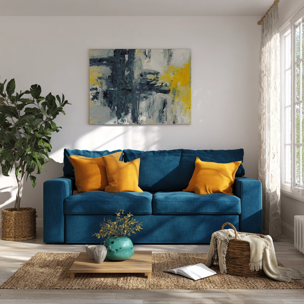
Ready to transform your home? Here are eight stunning bold color combos that deliver maximum impact. Each has been tested for balance, versatility, and emotional effect. First, sapphire blue and tangerine orange. This high-contrast pairing energizes any space. Blue brings calm depth while orange injects playful warmth. Perfect for living rooms or kitchens. Second, forest green and raspberry pink. A sophisticated yet lively combo. Green's natural serenity pairs beautifully with pink's soft vibrancy. Ideal for bedrooms or studies. Third, charcoal gray and sunflower yellow. Modern and cheerful. Gray provides sleek sophistication while yellow adds sunshine brightness. Great for home offices or entryways. Fourth, burgundy and teal. Rich and dramatic. Burgundy offers cozy warmth, teal brings cool freshness. Works well in dining rooms or libraries. Fifth, chocolate brown and turquoise. Earthy meets exotic. Brown grounds the space, turquoise adds tropical flair. Excellent for sunrooms or bathrooms. Sixth, slate blue and coral. Coastal-inspired freshness. Blue evokes ocean calm, coral brings beachy warmth. Perfect for bathrooms or casual living areas. Seventh, plum purple and mint green. Unexpected and refreshing. Purple adds regal depth, green introduces crisp contrast. Suitable for bedrooms or creative spaces. Eighth, brick red and olive green. Rustic elegance. Red provides hearty warmth, green adds natural balance. Ideal for kitchens or cozy nooks. When implementing these bold color combos, consider proportions. Use the bolder color for larger surfaces if you want drama. Use it as an accent if you prefer subtlety. Lighting affects all colors. Warm light enhances reds, oranges, yellows. Cool light benefits blues, greens, purples. Test under your home's specific conditions. These eight bold color combos offer starting points. Feel free to adjust shades to suit your taste. Lighter or darker versions can change the mood entirely. The key is confidence. Bold choices lead to memorable spaces that truly reflect you.
Conclusion
Embracing bold color combos represents more than just a design trend—it's a celebration of personal expression and emotional connection within our homes. Throughout this article, we've explored how these vibrant palettes can transform ordinary rooms into extraordinary spaces that inspire, comfort, and energize. From understanding room-specific needs to balancing colors with strategic neutrals, and discovering eight impactful combinations, you now have the tools to approach color with confidence. The future of home design continues to move toward individuality and creativity. As we spend more time in our living spaces, their ability to reflect our personalities and support our well-being becomes increasingly important. Bold color combos offer a powerful way to achieve this. They break free from conventional safe choices, inviting us to create environments that truly feel like our own. Looking ahead, expect to see even more innovative uses of color. Technology allows for custom paint mixing and digital visualization tools that make experimentation easier than ever. Sustainable, non-toxic paints in every imaginable hue continue to emerge, supporting both beautiful design and environmental responsibility. The takeaway is clear: don't be afraid to play with color. Start small if needed—a single accent wall or colorful furniture piece can make a significant difference. Remember that your home should evolve with you. Colors can be changed as your tastes or needs shift. Most importantly, trust your instincts. If a combination feels right to you, it likely is. Your home is your canvas, and bold color combos are your palette. Paint it with passion, and enjoy the vibrant life you create within those walls.
Frequently Asked Questions
Q: What are the most common mistakes people make when using bold color combos?
The most common mistakes include using too many colors at once, neglecting lighting considerations, and forgetting about balance. When people get excited about bold colors, they sometimes incorporate three or four vibrant hues in one room, creating visual chaos instead of harmony. Another frequent error is not testing colors in the actual space—paint looks different under various lighting conditions throughout the day. Many also forget to include enough neutral elements, which are crucial for giving the eye places to rest. Finally, some choose colors based solely on trends rather than personal preference, leading to spaces that don't feel authentically theirs.
Q: How can I incorporate bold color combos in a rental home where I can't paint walls?
You have plenty of options even without painting walls. Focus on removable elements like furniture, textiles, and decor. Choose a sofa, area rug, or curtains in one bold color, then add accent pieces in your complementary hue. Large artwork featuring your chosen combo can serve as a focal point. Removable peel-and-stick wallpaper offers temporary wall transformation. Don't overlook smaller items—throw pillows, blankets, vases, and books can all contribute to your color scheme. Even kitchenware and bathroom accessories can introduce bold colors. The key is to think vertically and horizontally—use floor coverings, wall hangings, and tabletop items to build layers of color throughout the space.
Q: Are there any bold color combos that work particularly well in small spaces?
Absolutely. For small spaces, consider combos with one lighter and one darker color to create depth without closing in the room. Navy blue and white works beautifully—the white keeps things airy while navy adds sophistication. Emerald green and soft pink offers a similar effect. Another excellent choice is charcoal gray and pale yellow—the gray grounds the space while yellow makes it feel sunny and open. If you want something warmer, try terracotta with cream. The cream prevents the terracotta from feeling too heavy. In all cases, use the lighter color on larger surfaces like walls or floors, and the bolder color as accents. Mirrors and good lighting will enhance any combo by making the space feel larger.