
Imagine stepping into a room that instantly wraps you in a comforting embrace, where the very walls seem to radiate tranquility and welcome. This isn’t just a fantasy—it’s the profound power of a warm color palette at work in your home. In our fast-paced, often digitally saturated lives, creating spaces that nurture our well-being has become more important than ever. A thoughtfully chosen warm color scheme serves as an essential tool in this endeavor, transforming sterile rooms into sanctuaries that promote relaxation, connection, and genuine comfort.
Warm colors—those rich hues inspired by fire, earth, and sunlight—include shades like terracotta, mustard yellow, burnt orange, deep reds, and creamy neutrals. These colors don't just decorate; they actively influence our mood and perception of space. Psychologically, they stimulate feelings of warmth, security, and intimacy, making rooms feel cozier and more inviting. Whether you're redesigning a living room, bedroom, or kitchen, incorporating a warm color palette can dramatically alter the atmosphere, turning your home into a true haven from the outside world.
Beyond aesthetics, these colors possess practical benefits too. They can make large, impersonal spaces feel more intimate and welcoming, perfect for open-plan living areas that might otherwise feel cold. In north-facing rooms with limited natural light, warm tones can counteract cool shadows, creating the illusion of sunshine even on cloudy days. As we spend more time at home, the emotional impact of our surroundings becomes undeniable. A warm color palette isn't merely a design trend—it's a fundamental approach to crafting environments that support our mental and emotional health, making every moment at home more enjoyable and restorative.
Why a Warm Color Palette Transforms Your Living Space
A warm color palette works its magic through both visual and psychological mechanisms that directly impact how we experience our homes. When you surround yourself with hues like terracotta, amber, or soft peach, you're not just adding color—you're creating an environment that feels inherently nurturing and secure. These colors remind us of comforting natural elements: the glow of a fireplace, the rich tones of autumn leaves, or the golden hour of sunset. This connection to nature and warmth triggers positive emotional responses, reducing stress and promoting relaxation in ways that cooler colors simply cannot match.
From a practical design perspective, warm colors possess unique properties that make them invaluable tools for interior styling. They advance visually, meaning they appear closer to the viewer than they actually are. This characteristic makes them perfect for large or cavernous rooms that need to feel more intimate and cozy. A dining room painted in a deep burgundy or warm taupe will instantly feel more enveloping and conducive to conversation than the same room in cool gray. Similarly, in spaces with high ceilings, using warm colors on the upper portions can help bring the ceiling down visually, creating a more balanced and comfortable proportion.
Beyond individual rooms, a cohesive warm color palette throughout your home creates a harmonious flow that feels both intentional and welcoming. This doesn't mean every room must be the same shade, but rather that colors should relate through similar undertones. A living room with terracotta walls might flow into a kitchen with honey-toned cabinets and brass fixtures, then into a bedroom with caramel-colored bedding. This thoughtful progression creates a sense of unity that makes your entire home feel like a cohesive sanctuary, where each space supports the overall atmosphere of comfort and warmth.
How to Create Your Perfect Warm Color Palette
Building your ideal warm color palette begins with understanding the spectrum of warm hues and how they interact. Start by identifying your base—the dominant color that will set the tone for your space. This might be a rich terracotta for a bold, earthy feel, or a soft peach for something more delicate and airy. From there, you can layer complementary shades that enhance rather than compete. Remember that warm colors range from fiery reds and oranges to mellow yellows and browns, with countless variations in between. Consider the room's function: a bedroom might benefit from soothing shades like warm taupe or blush pink, while a dining room could handle more dramatic tones like deep burgundy or mustard yellow.
Texture plays a crucial role in bringing a warm color palette to life. Combine matte and glossy finishes to add depth and interest—think matte walls with glossy trim, or velvet cushions against a linen sofa. Natural materials like wood, leather, and woven textiles enhance warm colors beautifully, adding organic warmth that feels authentic rather than contrived. When selecting furniture and accessories, look for pieces in materials that complement your color scheme: oak or walnut furniture, brass or copper lighting, ceramic or terracotta pottery. These elements add layers of warmth that go beyond color alone, creating a rich, tactile environment that feels genuinely cozy.
Lighting is another critical consideration when working with a warm color palette. Natural light will show these colors at their best, but artificial lighting must be chosen carefully. Warm white bulbs (2700K-3000K) will enhance red and yellow undertones, while cooler bulbs can make warm colors appear muddy or dull. Consider incorporating multiple light sources at different levels—overhead lighting, table lamps, floor lamps, and even candlelight—to create pools of warmth throughout the room. This layered approach to lighting ensures your warm color palette looks inviting at all times of day, from bright morning sunlight to cozy evening hours.
Warm Color Palette Inspiration for Every Room
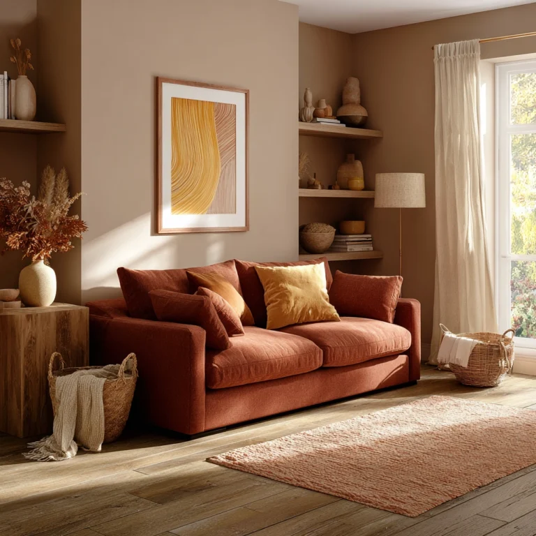
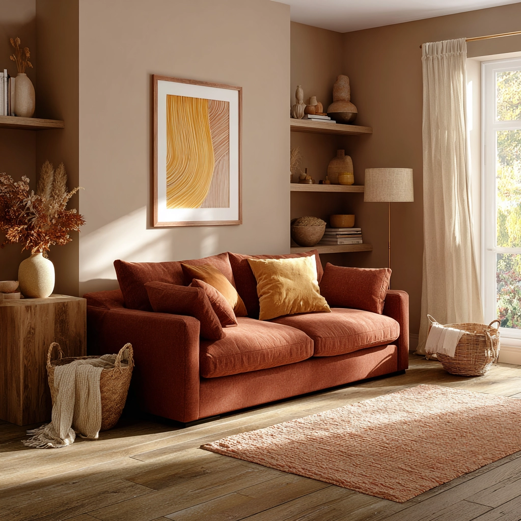
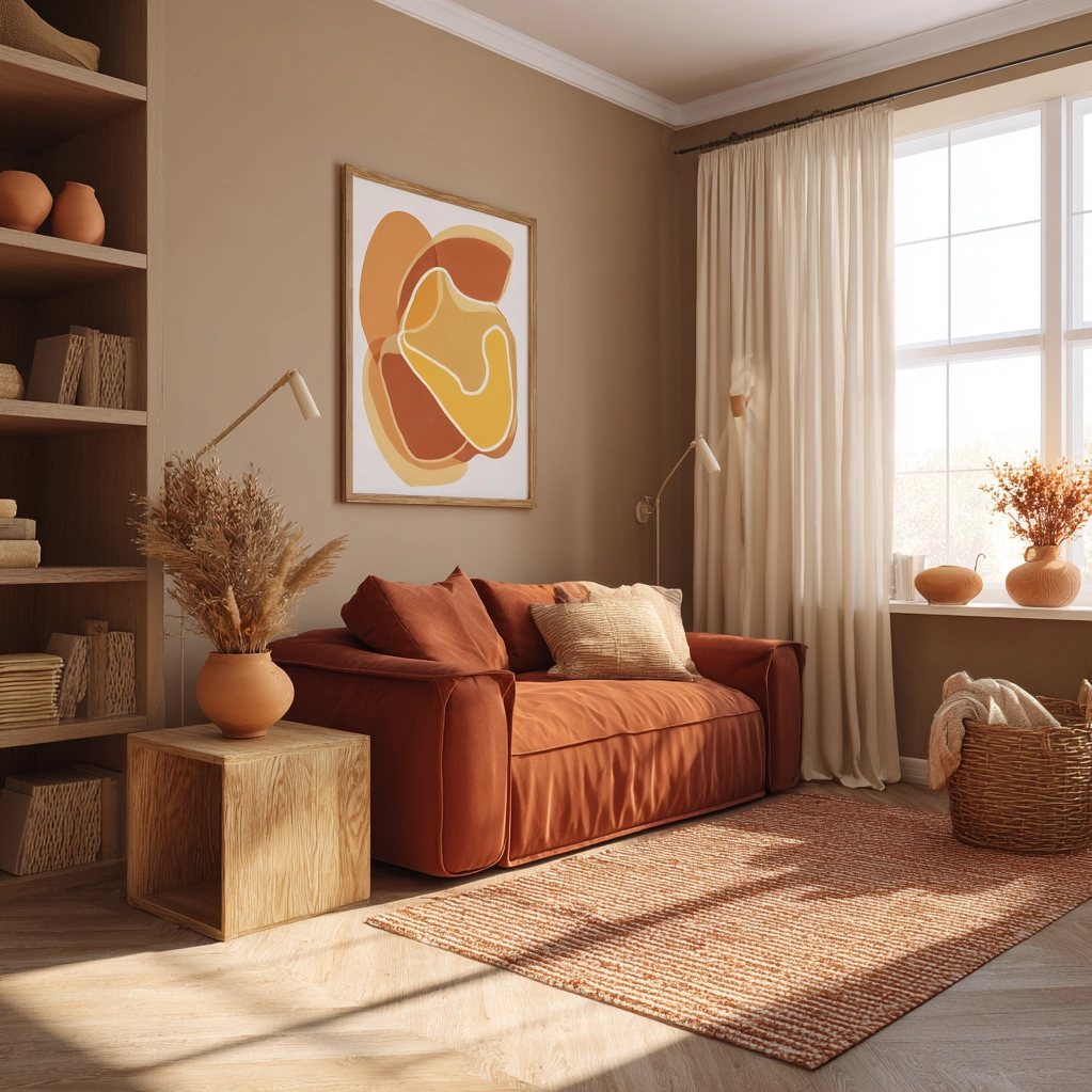
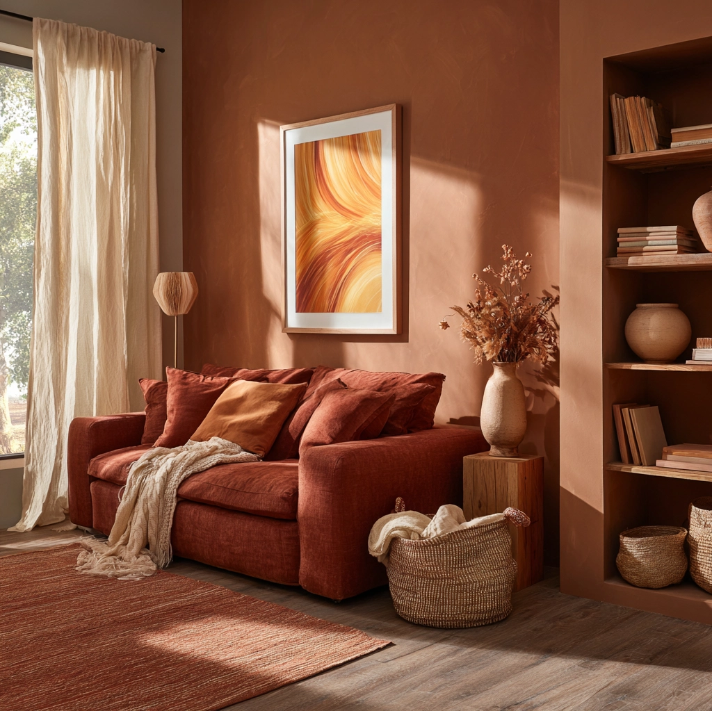
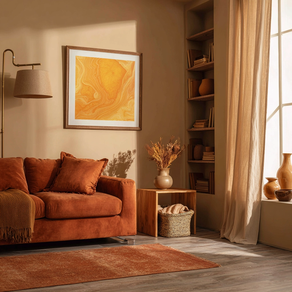
Your living room offers the perfect canvas for a warm color palette that encourages relaxation and connection. Start with walls in a soothing shade like warm taupe or soft terracotta, then layer in furniture in complementary tones. A sofa in chocolate brown or deep rust creates a comfortable anchor, while accent chairs in mustard yellow or burnt orange add visual interest. Textiles are where you can really play with pattern and texture—consider velvet cushions in rich jewel tones, a chunky knit throw in cream or caramel, and a rug with warm undertones that ties everything together. Don't forget artwork and accessories: framed prints with warm color schemes, pottery in earthy glazes, and books with warm-toned spines all contribute to the cohesive, inviting atmosphere.
In the bedroom, a warm color palette promotes rest and rejuvenation. Soft, muted versions of warm colors work best here—think blush pink, warm gray, or sandy beige for walls. Your bedding provides another opportunity to introduce warmth: opt for duvet covers in shades like terracotta, ochre, or rust, layered with neutral sheets for balance. Window treatments in warm colors help create a cocoon-like effect, especially when made from heavier fabrics like velvet or linen. Consider an area rug in a warm tone to add softness underfoot, and bedside lighting with warm bulbs to create a gentle glow in the evening. The goal is to create a space that feels like a retreat, where the color scheme actively contributes to a sense of peace and comfort.
Even functional spaces like kitchens and bathrooms can benefit from a warm color palette. In the kitchen, warm wood cabinetry in oak or walnut creates an instant feeling of warmth, complemented by brass or copper hardware and fixtures. Backsplashes in warm-toned tiles—think terracotta, subway tiles in cream or light pink, or even warm gray—add texture without overwhelming the space. For bathrooms, consider warm neutrals on walls and floors, then introduce warmth through accessories: towels in rust or mustard, a wooden stool or shelf, pottery for storage, and warm lighting around the mirror. These touches transform purely functional rooms into spaces that feel considered and comforting, proving that a warm color palette can work beautifully anywhere in your home.
Avoiding Common Warm Color Palette Mistakes
While a warm color palette offers numerous benefits, certain pitfalls can undermine its effectiveness if not addressed. One common mistake is using warm colors that are too bright or saturated, which can feel overwhelming rather than comforting. Instead, opt for muted, sophisticated versions of warm hues—dusty rose rather than bright pink, ochre rather than neon yellow, burgundy rather than fire-engine red. These subtler shades create depth and richness without assaulting the senses. Another error is neglecting balance. Warm colors need cooling elements to prevent spaces from feeling stuffy or closed-in. Incorporate neutral foundations like warm white, cream, or light gray to provide breathing room, and consider adding touches of cooler colors in small doses—perhaps through artwork, ceramics, or a single accent piece that provides contrast without disrupting the overall warmth.
Scale and proportion matter tremendously when working with a warm color palette. Using too much of a single warm color, especially in a small space, can make it feel cramped and oppressive. Instead, distribute warm tones throughout the room in varying proportions: perhaps warm walls with neutral furniture, or neutral walls with warm furniture and textiles. Pay attention to how colors interact at different times of day—a shade that looks perfect in afternoon light might appear too intense under artificial lighting in the evening. Always test paint samples on large swatches that you can view in different lights before committing. Similarly, consider how your warm color palette will flow from room to room. Abrupt transitions between warm and cool schemes can feel jarring; instead, create gentle progressions using related undertones or neutral buffers between differently colored spaces.
Finally, remember that a successful warm color palette extends beyond paint alone. The warmth of your flooring, furniture materials, textiles, and lighting all contribute to the overall atmosphere. A room with warm-colored walls but cool gray flooring and silver fixtures might feel disjointed. Strive for cohesion by ensuring all elements support the warm theme. Choose wood floors with warm undertones (like oak rather than ash), select furniture in warm woods or upholstered in warm fabrics, and opt for lighting fixtures and hardware in finishes like brass, copper, or oil-rubbed bronze rather than chrome or nickel. When every element works together harmoniously, your warm color palette will create the inviting, comforting environment you envision.
Conclusion
Embracing a warm color palette in your home is about more than following design trends—it's about creating environments that nurture well-being, foster connection, and provide genuine comfort. As we've explored, these rich, inviting hues transform spaces both visually and emotionally, turning houses into homes that actively support our daily lives. From the psychological benefits of reduced stress to the practical advantages of more intimate-feeling rooms, the impact of carefully chosen warm colors is profound and lasting.
Looking forward, the appeal of warm color palettes shows no signs of diminishing. In fact, as our lives become increasingly digital and fast-paced, the desire for homes that offer tactile warmth and emotional sanctuary will likely grow stronger. We can expect to see continued innovation in warm color applications—new paint formulations that capture the depth of natural pigments, textiles that combine warmth with sustainability, and lighting solutions that enhance warm tones beautifully throughout the day and night. The future of home design seems poised to prioritize authenticity and comfort, with warm color palettes playing a central role in this evolution.
Your journey with warm colors can begin simply. Start with one room, perhaps with an accent wall in a warm shade you love, or by introducing warm textiles through cushions and throws. Notice how these changes affect the room's atmosphere and your mood within it. As you grow more confident, you can expand your warm color palette to other spaces, creating a cohesive flow throughout your home. Remember that the most successful interiors reflect the people who live in them—choose warm colors that resonate with you personally, that make you feel comforted and uplifted. Your home should be your sanctuary, and a thoughtfully implemented warm color palette is one of the most powerful tools you have to make it so.
Frequently Asked Questions
Q: What are the best warm colors for small rooms to avoid making them feel cramped?
For small rooms, opt for lighter, muted versions of warm colors rather than deep, saturated shades. Soft peach, warm taupe, pale terracotta, or creamy yellow work beautifully to add warmth without overwhelming the space. These lighter tones reflect more light, helping the room feel more open and airy while still providing that comforting warmth. Pair these wall colors with neutral or light-colored flooring and furniture to maintain a sense of spaciousness. Using warm colors on just one accent wall rather than all four can also prevent a small room from feeling too enclosed while still incorporating the benefits of a warm palette.
Q: Can I mix warm and cool colors in the same room successfully?
Yes, you can successfully mix warm and cool colors, but balance is key. The most effective approach is to choose one temperature as dominant—in this case, warm—and use cool colors as accents. For example, a room with warm terracotta walls and mustard yellow furniture might incorporate cool blue accents through artwork, ceramics, or a single piece of furniture. The cool elements should comprise no more than 20-30% of the color scheme to maintain the overall warm atmosphere. Alternatively, you can use neutral colors as bridges between warm and cool tones. Warm gray, for instance, contains both warm and cool undertones and can help transitional spaces feel cohesive when mixing color temperatures.
Q: How do I choose the right warm color palette for north-facing rooms with limited natural light?
North-facing rooms present a particular challenge as they receive cool, indirect light that can make warm colors appear dull or flat. To counteract this, choose warm colors with yellow or peach undertones rather than those with gray or blue undertones. Shades like creamy yellow, soft peach, warm beige, or light terracotta will help brighten the space and add warmth despite the cool light. Avoid dark, saturated warm colors as they can make north-facing rooms feel gloomy. Instead, use deeper warm tones as accents through furniture, textiles, or artwork against lighter walls. Maximize artificial lighting with warm white bulbs (2700K-3000K) to enhance the warmth of your color palette during darker hours, and consider adding mirrors to reflect whatever natural light is available.