
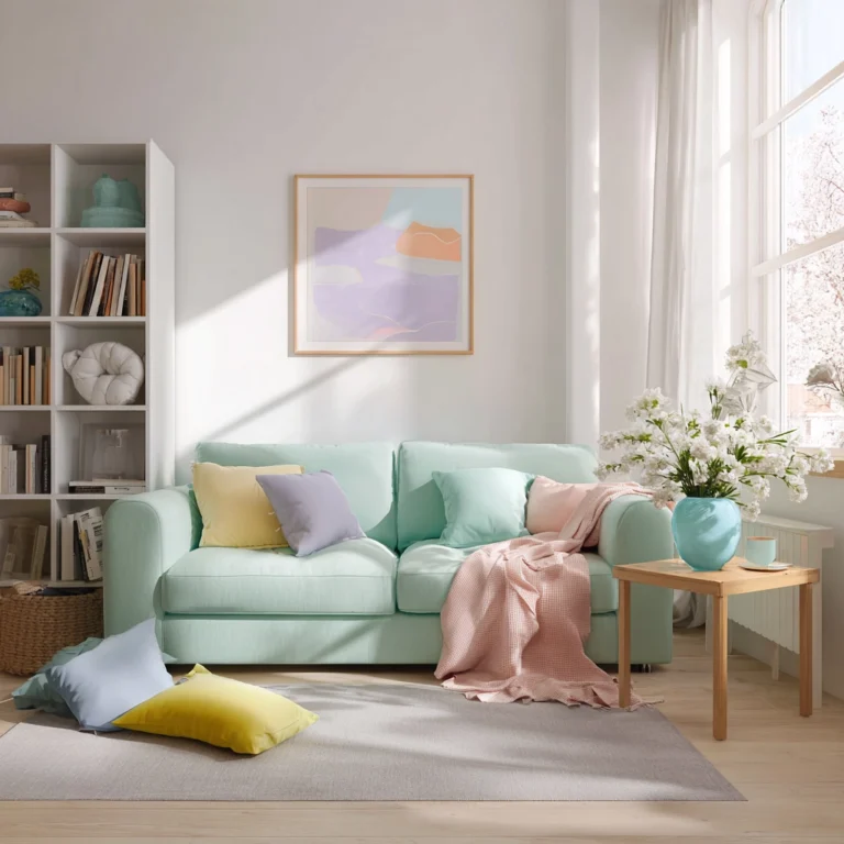

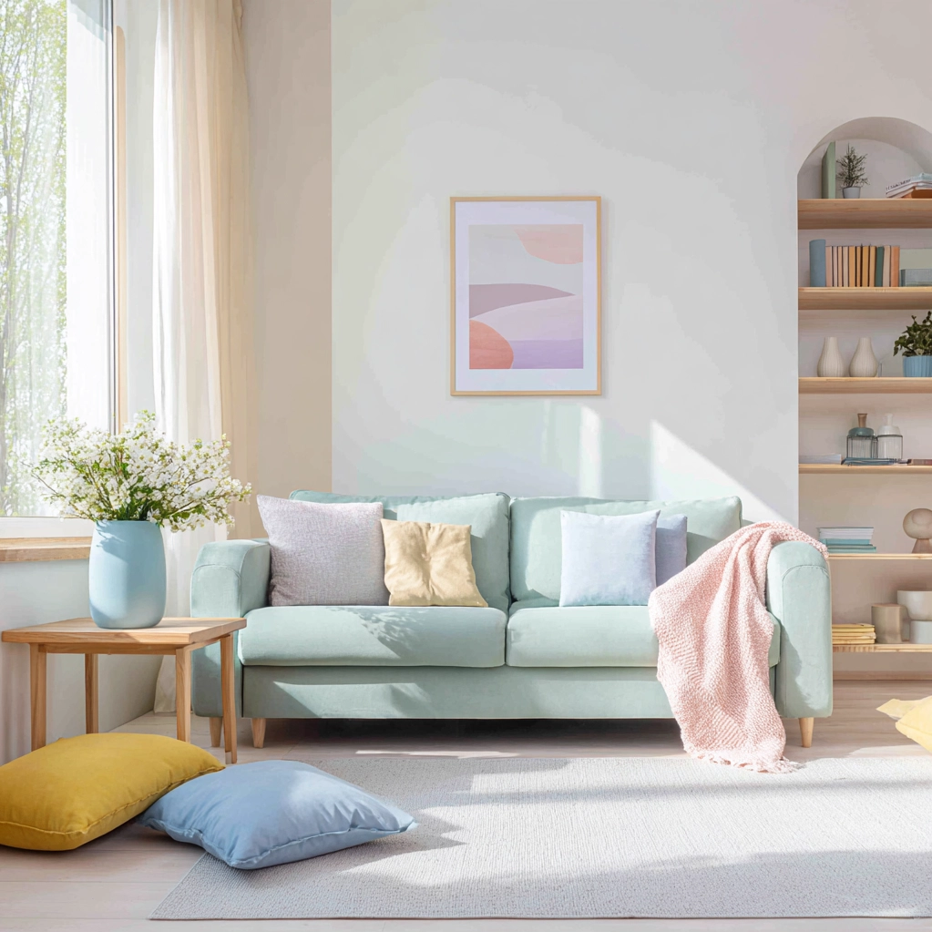
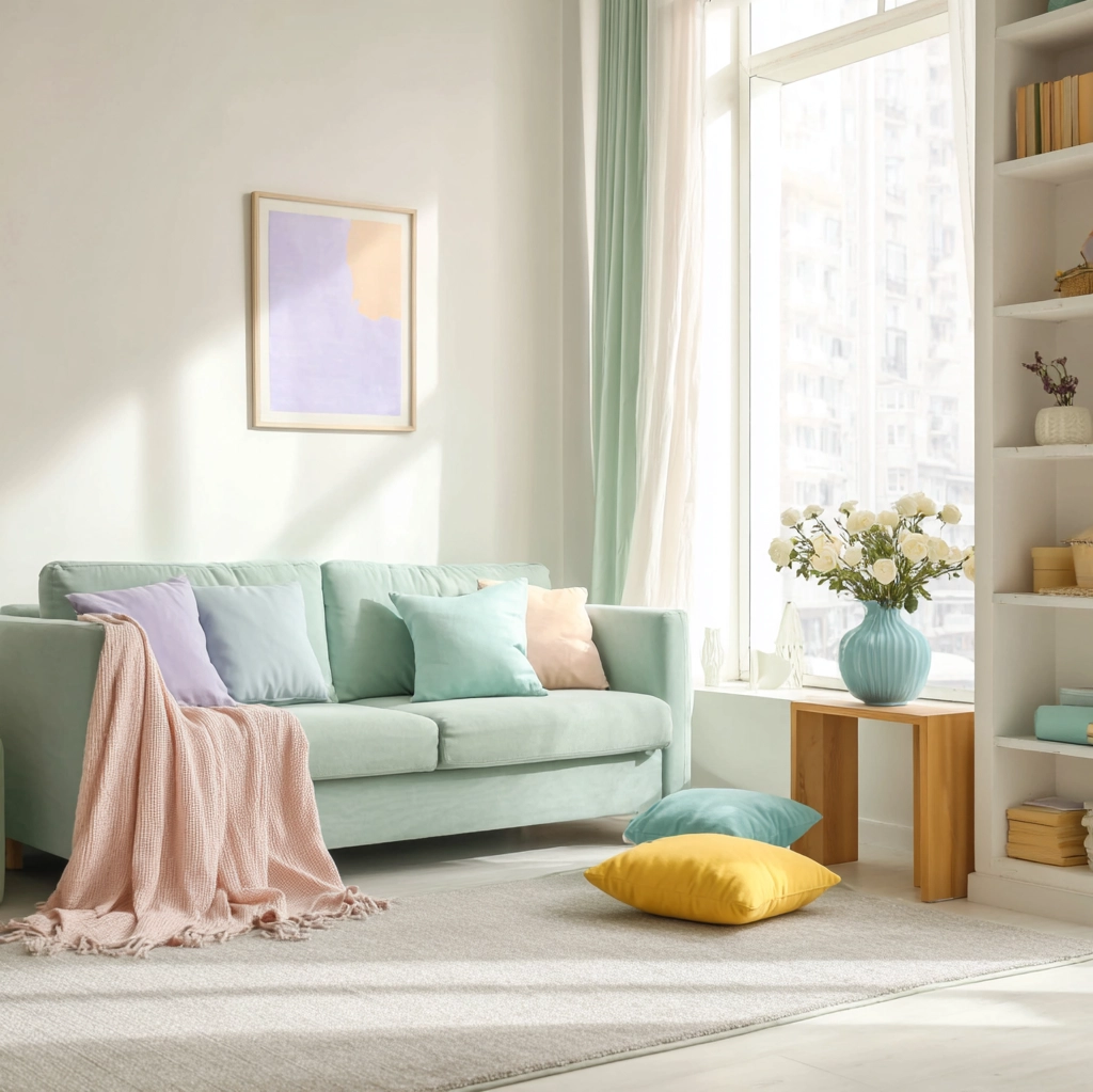
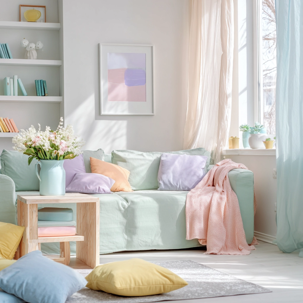
Imagine walking into a room that instantly calms your senses and lifts your spirits. This is the magic a pastel color palette can bring to your home. These soft, muted hues—think blush pink, mint green, sky blue, and lavender—offer more than just aesthetic appeal. They create environments that feel spacious, peaceful, and welcoming. In today’s fast-paced world, our homes need to be sanctuaries where we can unwind and recharge. A pastel color palette provides exactly that gentle refuge without sacrificing style. Many people hesitate to use pastels, fearing they might look too childish or lack sophistication. However, when done right, these colors can transform ordinary spaces into extraordinary havens. They reflect light beautifully, making rooms appear larger and brighter. This is especially valuable in smaller apartments or homes with limited natural light. Pastels also pair wonderfully with various design styles, from modern minimalism to cozy farmhouse chic. By choosing a pastel color palette, you’re not just decorating—you’re crafting an atmosphere that nurtures well-being. This article will guide you through selecting, combining, and implementing these soothing shades to create a home that feels both stylish and serene.
Choosing the Perfect Pastel Color Palette for Your Home
Selecting the right pastel color palette starts with understanding your space and personal style. Begin by assessing the room's natural light. North-facing rooms with cooler light benefit from warm pastels like peach or butter yellow, which add warmth. South-facing rooms with abundant light can handle cooler pastels like mint or lavender without feeling chilly. Consider the room's function too. Bedrooms thrive with calming pastels like soft blue or sage green, promoting relaxation. Living areas might use slightly brighter pastels like coral or sky blue to encourage social interaction. Don't forget existing furniture and decor. A pastel color palette should complement, not clash with, your key pieces. Test paint samples on walls at different times of day to see how colors change with lighting. For a cohesive look, choose one dominant pastel and two to three accent shades. The dominant color covers large areas like walls, while accents appear in textiles, artwork, or accessories. Remember, pastels work beautifully with neutrals. Pair them with white, beige, or gray to prevent overwhelming the space. This balance creates a sophisticated yet soothing environment. With careful selection, your pastel color palette will feel intentional and harmonious.
Combining Pastel Color Palette with Different Design Styles
A pastel color palette adapts seamlessly to various interior design styles, adding softness and charm. For modern minimalist spaces, use pastels sparingly against clean lines and neutral backdrops. A single pastel accent wall in blush pink or pale blue can define a room without clutter. Scandinavian design embraces pastels through natural materials. Think soft gray-blue walls with light wood furniture and cozy textiles. This creates a hygge-inspired cozy atmosphere. In bohemian interiors, layer multiple pastel shades in textiles, rugs, and pillows. Mix mint green, lavender, and peach for a vibrant yet relaxed look. Pair with plants and woven baskets for earthy balance. Traditional spaces benefit from pastels in upholstery or wallpapers. Soft green or yellow pastels on classic furniture pieces add freshness without losing elegance. Industrial styles can soften with pastels too. Use concrete gray walls as a base, then add pastel accents in metal fixtures or artwork. This blends raw edges with gentle hues. Farmhouse chic loves pastels in kitchen cabinets or open shelving. Pale blue or sage green cabinets create a cheerful, rustic feel. Remember, texture enhances pastels. Combine matte paints with glossy finishes or soft fabrics with hard surfaces. This adds depth to your pastel color palette, making it dynamic and engaging.
Practical Tips for Implementing a Pastel Color Palette
Implementing a pastel color palette successfully requires attention to detail and practical strategies. Start with paint, the easiest way to introduce pastels. Use them on walls, ceilings, or trim. For a subtle effect, paint only an accent wall or the ceiling in a pastel hue. This adds interest without overwhelming. In rooms with low light, choose lighter pastels to maximize brightness. Consider finish too—eggshell or satin finishes reflect light well, enhancing the pastel's soft glow. Furniture in pastel colors makes a bold statement. A pastel sofa or armchair becomes a focal point. Balance it with neutral surroundings to avoid a candy-colored look. Textiles are perfect for testing pastels. Add pastel throw pillows, blankets, or curtains. These are easy to change if you want to update the look later. Artwork and decor items in pastel shades tie the palette together. Look for paintings, vases, or rugs that incorporate your chosen colors. Layering different pastels creates depth. For example, use mint green walls with lavender cushions and peach accessories. This adds visual interest while maintaining harmony. Don't forget lighting. Warm white bulbs enhance pastels' warmth, while cool bulbs suit cooler pastels. Finally, incorporate natural elements. Wood, plants, and stone ground pastel color palettes, preventing them from feeling too artificial. With these tips, your pastel palette will feel cohesive and livable.
Maintaining and Refreshing Your Pastel Color Palette Over Time
A pastel color palette remains stylish with proper maintenance and occasional updates. Regular cleaning keeps pastel surfaces looking fresh. Dust walls gently and clean fabrics according to care labels to prevent fading. Sunlight can bleach pastels over time. Use curtains or blinds to protect sensitive areas during peak hours. This preserves the vibrancy of your pastel color palette. As trends evolve, you might want to refresh your palette without a complete overhaul. Swap out accessories like pillows, rugs, or artwork for new pastel shades. This is cost-effective and quick. For example, change from lavender to soft yellow accents for a seasonal update. Repainting is another option. If walls show wear, touch up with the same paint or consider a new pastel tone. Pastels like blush pink or sage green have timeless appeal, making them safe for long-term use. To keep the palette feeling current, incorporate metallic accents. Gold or brass fixtures add warmth, while silver or chrome offer a modern touch. These metals complement pastels beautifully. Plants also refresh the look. Greenery adds natural color contrast, enhancing pastel hues. Rotate decor items seasonally—lighter pastels for spring and summer, deeper ones for fall and winter. This keeps your space dynamic. Remember, a pastel color palette should evolve with your lifestyle. Adjust it as your needs change, ensuring it always feels personal and welcoming.
Conclusion
Embracing a pastel color palette in your home is more than a design choice—it's a commitment to creating a serene and uplifting environment. These soft hues offer versatility, working across various styles from modern to traditional, while promoting tranquility and light. By carefully selecting colors that complement your space's light and function, combining them with thoughtful textures and accents, and maintaining them over time, you can craft a home that feels both stylish and soothing. The future of interior design continues to value well-being, and pastels align perfectly with this trend, offering aesthetic pleasure and emotional comfort. As you move forward, consider experimenting with pastels in unexpected ways, like in home offices or entryways, to extend their calming influence throughout your entire living space. Remember, the best pastel color palette is one that reflects your personality and enhances your daily life. Start small if needed, with accessories or an accent wall, and gradually build confidence. Your home should be a sanctuary, and with pastels, you're well on your way to achieving that peaceful, beautiful retreat.
Frequently Asked Questions
Q: Are pastel colors suitable for small rooms?
Yes, pastel colors are excellent for small rooms. Their light, reflective qualities make spaces appear larger and brighter. Choose soft pastels like pale blue, mint green, or blush pink to maximize this effect. Pair with light-colored furniture and mirrors to enhance the sense of space. Avoid dark accents that might shrink the room visually. Pastels create an airy, open feel, perfect for compact areas.
Q: How do I prevent a pastel color palette from looking too childish?
To keep a pastel color palette sophisticated, balance it with mature elements. Use pastels as accents against neutral backgrounds like white, gray, or beige. Incorporate textures such as linen, wood, or metal to add depth. Choose subdued pastel shades rather than bright ones. Avoid overusing multiple pastels in one room—stick to a cohesive palette of two to three hues. Pair with modern furniture and minimal decor for a polished look.
Q: Can pastel colors work in rooms with little natural light?
Pastel colors can work in low-light rooms if chosen carefully. Opt for warmer pastels like peach, butter yellow, or soft pink, which add warmth without needing much light. Use high-reflectivity paint finishes like satin or eggshell to bounce available light around. Complement with ample artificial lighting, such as warm white LED bulbs, to enhance the colors. Avoid cool pastels like lavender or mint in very dark rooms, as they might feel chilly.