
Imagine walking into a room that instantly makes you feel calm, cozy, and embraced by gentle warmth. That’s the magic of a soft pink background in interior design. Far from being just a pretty color, this subtle hue has become a powerful tool for creating inviting, sophisticated spaces that nurture both style and well-being. As we spend more time at home, the colors surrounding us play a crucial role in shaping our mood, productivity, and overall sense of comfort. A soft pink background offers a versatile foundation that works across various design aesthetics—from minimalist Scandinavian to eclectic bohemian—providing just enough color to add character without overwhelming the senses. This delicate shade has evolved beyond traditional feminine associations to become a neutral alternative to whites and beiges, bringing subtle warmth that makes spaces feel lived-in and welcoming. Whether you’re designing a bedroom, living room, or even a home office, understanding how to effectively use this hue can transform ordinary rooms into extraordinary sanctuaries. The key lies in balancing the pink’s softness with other elements to create harmony rather than monotony. Let’s explore how this seemingly simple background color can become the cornerstone of your home’s aesthetic, creating environments that are both beautiful and functional.
The Psychology Behind a Soft Pink Background
A soft pink background isn't merely decorative—it actively influences how we experience a space through psychological principles. This gentle hue operates at the intersection of color theory and emotional response, creating environments that soothe rather than stimulate. Unlike brighter pinks that can feel energetic or even aggressive, the muted tones of a soft pink background promote relaxation and reduce stress by lowering heart rates and calming the nervous system. Research in environmental psychology suggests that these pale pink shades can create a sense of safety and comfort, making them ideal for bedrooms, reading nooks, and meditation spaces where tranquility is paramount. The color's subtle warmth encourages feelings of nurturing and care, which explains its growing popularity in spaces designed for rest and rejuvenation. When used as a backdrop, soft pink provides just enough visual interest to prevent spaces from feeling sterile or cold, yet remains neutral enough to support various activities without distraction. This balance makes it particularly effective in home offices where concentration and comfort must coexist. The color's versatility stems from its ability to reflect light softly, creating a diffused glow that flatters both people and furnishings. By understanding these psychological effects, you can strategically deploy a soft pink background to enhance specific moods and functions within your home, turning color into a tool for well-being.
Designing with a Soft Pink Background in Different Rooms
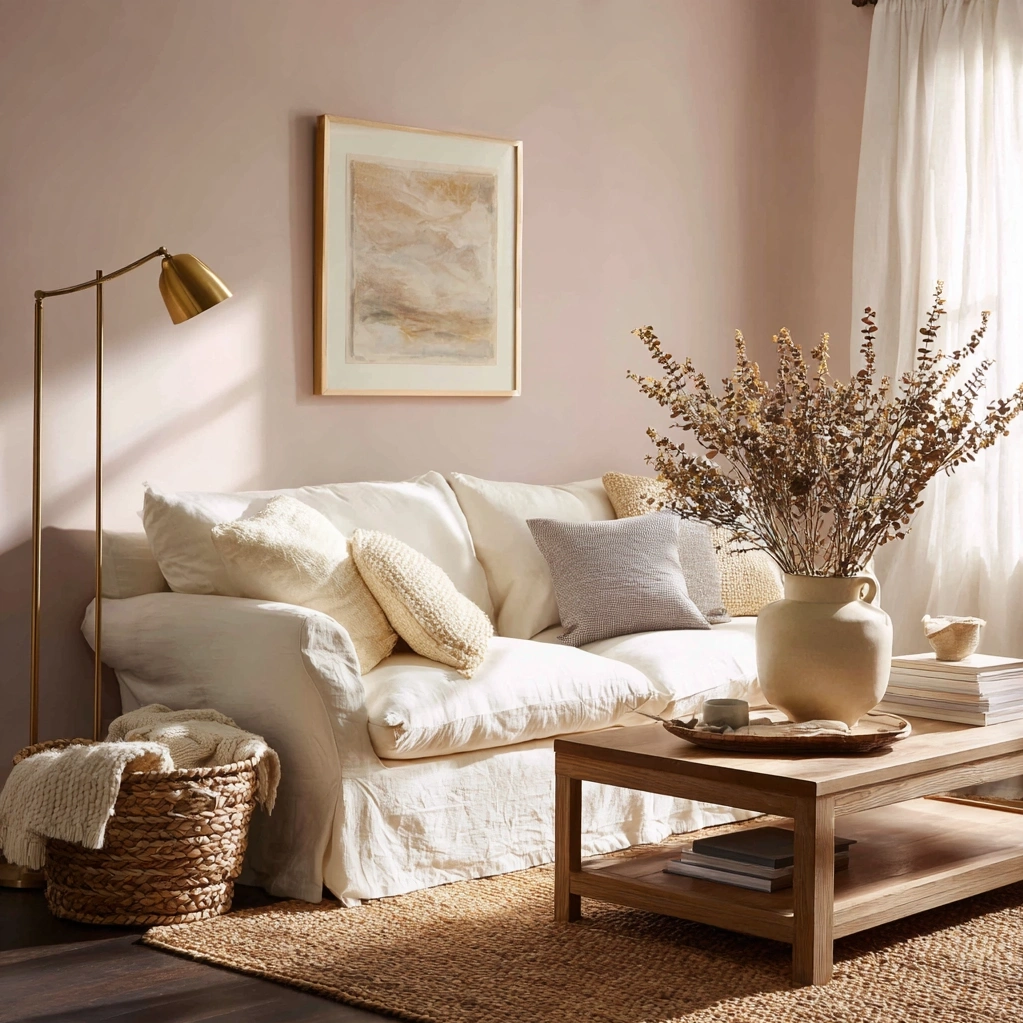
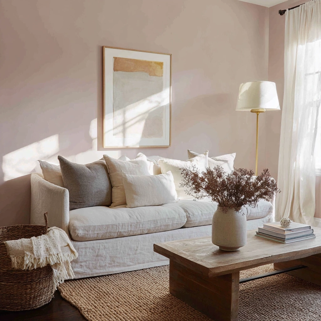
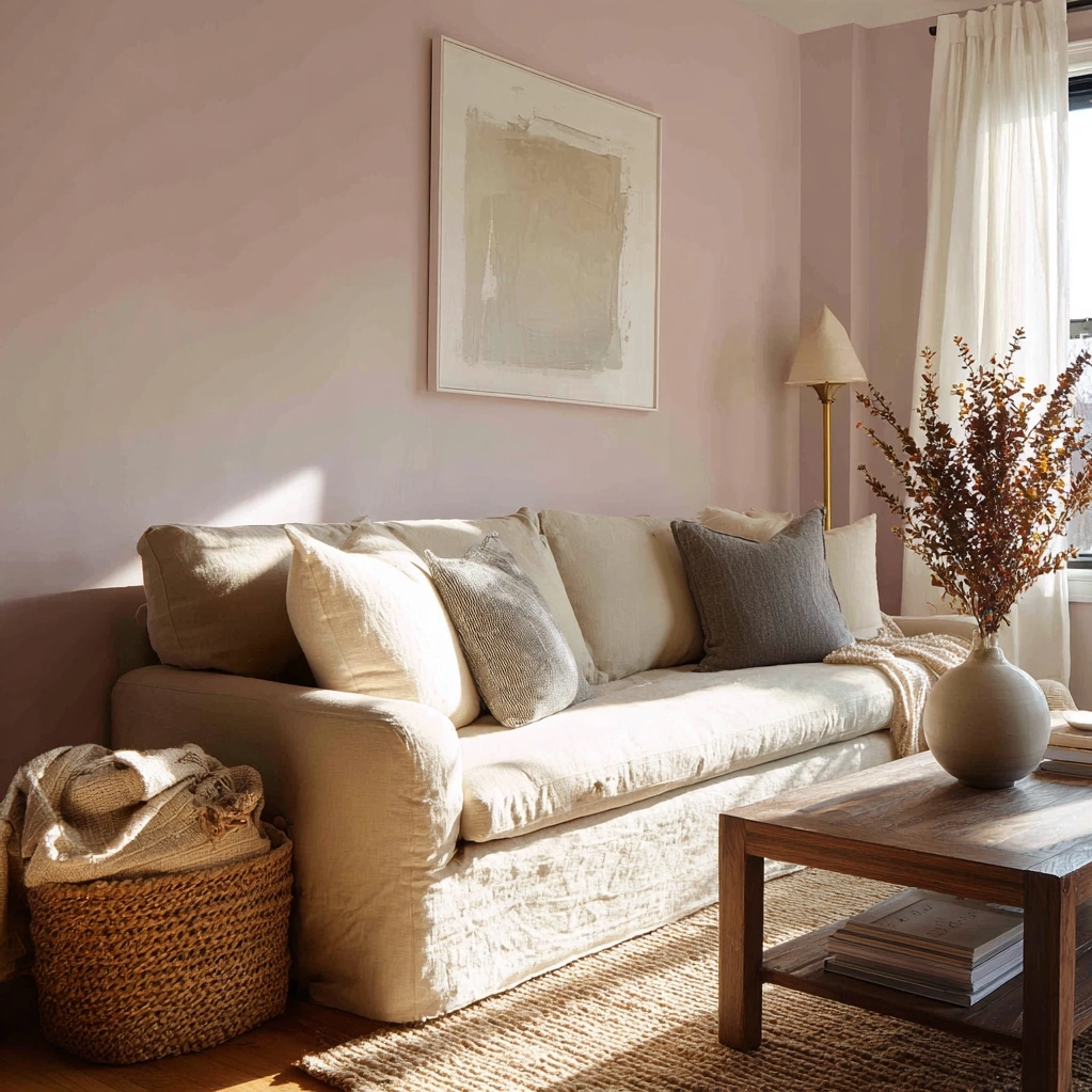
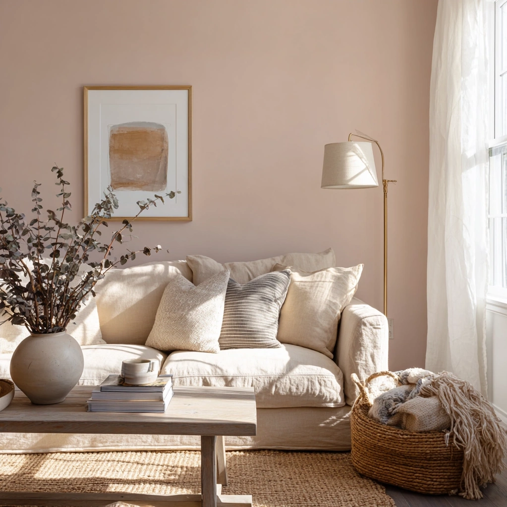
Implementing a soft pink background requires thoughtful consideration of each room's purpose and existing elements. In living rooms, this hue creates an inviting atmosphere when paired with natural textures like woven baskets, linen curtains, and wooden furniture. Consider painting one accent wall in a matte soft pink while keeping others neutral to add depth without overwhelming the space. For bedrooms, a soft pink background promotes restful sleep when combined with layered bedding in complementary shades like cream, taupe, or slate gray. Install dimmable lighting to enhance the color's calming effect during evening hours. In kitchens and dining areas, use soft pink as a backsplash or cabinet color to add warmth to functional spaces, balancing it with stainless steel appliances and marble countertops for contrast. Home offices benefit from soft pink walls that reduce eye strain and create a focused yet comfortable environment—pair with ergonomic furniture and ample natural light. For small spaces like bathrooms or entryways, a soft pink background can make rooms feel larger and more welcoming when used on all surfaces. Always test paint samples in different lighting conditions before committing, as natural and artificial light dramatically affect how the color appears. Remember that a soft pink background serves as a foundation; layer in other colors and textures to create visual interest and prevent the space from feeling flat or monotonous.
Perfect Pairings: Colors and Textures for Your Soft Pink Background
A soft pink background truly shines when thoughtfully combined with complementary colors and textures. For a harmonious look, pair it with other muted tones like sage green, dusty blue, or warm beige—these combinations create serene, cohesive spaces that feel intentionally designed. Incorporate metallic accents in brass or copper to add sophistication and reflect light, preventing the pink from appearing too sweet or juvenile. Textural contrast is equally important; mix smooth surfaces like velvet upholstery with rough elements like jute rugs or reclaimed wood furniture to create depth and tactile interest. When working with patterns, choose designs that incorporate your soft pink background alongside neutral tones, avoiding overly busy prints that might compete with the wall color. For bold contrast, introduce small doses of deeper colors like charcoal gray, navy blue, or emerald green through accessories like throw pillows, artwork, or decorative objects. These darker accents ground the space and prevent it from feeling too ethereal. Natural materials are particularly effective against a soft pink background—think rattan chairs, stone tabletops, and ceramic vases that bring organic warmth. If you prefer monochromatic schemes, layer different shades of pink from pale blush to muted terracotta, using texture to distinguish between elements. Remember that your soft pink background should enhance, not dominate; let it serve as a gentle canvas that allows other design elements to shine while maintaining overall coherence.
4 Essential Tips for Maintaining Your Soft Pink Background
Keeping your soft pink background looking fresh and intentional requires ongoing attention to detail. First, regular cleaning is crucial—dust and dirt can mute the color's subtlety over time. Use a soft microfiber cloth for painted walls and follow manufacturer guidelines for wallpaper or textured finishes. Second, monitor how natural light affects the color throughout the day and seasons; you may need to adjust window treatments or lighting to maintain the desired tone. Third, touch up paint chips or scratches promptly to prevent noticeable patches, keeping extra paint stored properly for exact color matching. Fourth, reassess your decor periodically—as you add new furniture or accessories, ensure they continue to complement rather than clash with your soft pink background. Consider these tips as part of a holistic approach to maintaining your space's aesthetic integrity. Beyond practical maintenance, think about how the background interacts with seasonal changes; lighter textiles in summer and heavier layers in winter can keep the space feeling current while honoring the foundational color. If you notice the pink appearing dated or overwhelming, introduce new accent colors or artwork to refresh the look without repainting. Remember that a soft pink background is a living element of your home that evolves with your tastes and needs—regular evaluation ensures it continues to serve its purpose beautifully.
Conclusion
A soft pink background offers far more than mere decoration—it provides a foundation for creating spaces that are both aesthetically pleasing and emotionally supportive. Throughout this exploration, we've seen how this versatile hue can transform rooms through psychological benefits, strategic pairings, and thoughtful maintenance. The key takeaway is that successful implementation requires balance: allowing the soft pink to enhance without overwhelming, to soothe without boring, and to unify without monotonizing. As design trends continue to emphasize well-being and personal expression, this gentle background color stands out as a timeless choice that adapts to evolving styles and needs. Looking forward, we can expect to see soft pink backgrounds integrated with even more innovative materials and technologies, from eco-friendly paints to smart lighting systems that adjust the color's appearance throughout the day. Whether you're refreshing a single room or redesigning your entire home, remember that the most impactful spaces often begin with a simple, thoughtful foundation. Let your soft pink background be that starting point—a canvas upon which you layer life, comfort, and personal style. Start small with an accent wall or accessory collection, observe how the color makes you feel, and gradually expand its presence as you grow more confident in its transformative power.
Frequently Asked Questions
Q: Will a soft pink background make my room look too feminine or childish?
Not at all when implemented thoughtfully. The key is choosing the right shade—opt for muted, dusty pinks with gray or beige undertones rather than bright bubblegum hues. Pair with neutral furnishings, natural materials, and metallic accents to create a sophisticated, gender-neutral look. Many modern designers use soft pink as a warm alternative to white or beige, creating spaces that feel inviting without being overtly feminine.
Q: What types of lighting work best with a soft pink background?
Soft pink backgrounds thrive under layered lighting. Maximize natural daylight to reveal the color's true subtlety. For artificial lighting, choose warm white bulbs (2700K-3000K) rather than cool tones, as they enhance the pink's warmth without casting unflattering shadows. Incorporate dimmable overhead lights, table lamps with fabric shades to diffuse light gently, and strategic accent lighting to highlight textures. Avoid harsh fluorescent lighting that can make the color appear washed out or uneven.
Q: Can I use a soft pink background in a small or dark room?
Absolutely—in fact, soft pink can be particularly effective in small or dimly lit spaces. Lighter shades of soft pink reflect available light better than dark colors, making rooms feel more spacious and airy. In north-facing rooms with limited natural light, choose pink with warm peach or coral undertones to counteract cool gray light. For very small rooms, consider using the same soft pink on walls, trim, and ceilings to eliminate visual boundaries and create a cohesive, expansive feel.