
Imagine walking into a room that instantly calms your nerves, lifts your spirits, and wraps you in a gentle embrace of color. That’s the transformative power of a pastel pink background in home decor. Far from being just a pretty shade, this versatile hue has become a design favorite for its ability to create serene, inviting spaces that work across various styles. In today’s fast-paced world, our homes serve as sanctuaries, and the colors we choose play a crucial role in shaping our daily experiences. A pastel pink background offers more than aesthetic appeal—it brings psychological benefits, promoting feelings of warmth, comfort, and tranquility. Whether you’re looking to refresh a single wall or completely reimagine your living environment, understanding how to effectively incorporate this color can dramatically enhance your home’s atmosphere. This article will guide you through everything you need to know about using pastel pink backgrounds to create spaces that are not only beautiful but also deeply personal and functional. From selecting the perfect shade to pairing it with complementary elements, we’ll explore how this soft color can become the foundation for your dream interior.
Why Choose a Pastel Pink Background for Your Home
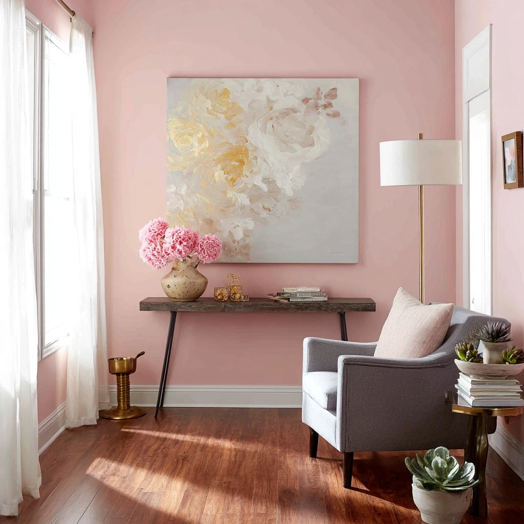
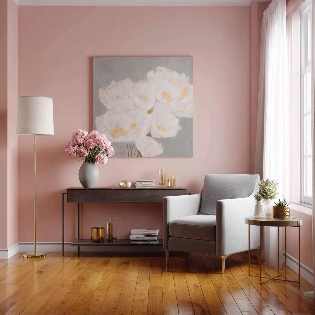
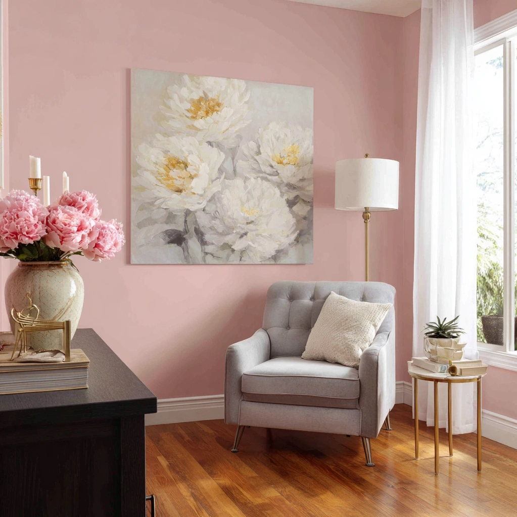
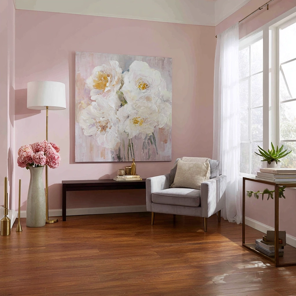
Selecting a pastel pink background for your home might seem like a purely aesthetic choice, but it's rooted in deeper psychological and practical benefits. This soft hue creates an immediate sense of calm and comfort, making it perfect for bedrooms, living rooms, and even home offices where relaxation and focus are essential. Unlike bolder pinks that can feel overwhelming, pastel pink maintains a subtle presence that works beautifully throughout the day, shifting gently with natural light to create dynamic but soothing environments. From a design perspective, pastel pink backgrounds offer incredible versatility. They serve as neutral foundations that complement a wide range of colors and textures, from crisp whites and natural woods to metallic accents and bold contrasting hues. This flexibility means you can easily update your decor over time without needing to repaint. Additionally, pastel pink backgrounds have a unique ability to make spaces feel larger and brighter by reflecting light effectively. They're particularly useful in rooms with limited natural light, where they can counteract dark corners and create an illusion of airiness. Whether you're working with modern minimalism, rustic charm, or eclectic bohemian styles, a pastel pink background provides the perfect canvas for expressing your personal taste while maintaining a cohesive, harmonious look throughout your home.
5 Creative Ways to Incorporate a Pastel Pink Background
Implementing a pastel pink background doesn't mean you have to paint every wall the same color. There are numerous creative approaches that can give you the benefits of this beautiful hue while adding visual interest to your space. First, consider an accent wall in your living room or bedroom—this focal point creates drama without overwhelming the entire room. For more subtle integration, try painting the lower half of your walls with a pastel pink background and pairing it with white wainscoting for a classic, elegant look. Second, think beyond paint. Wallpaper with pastel pink backgrounds offers endless pattern possibilities, from delicate florals to geometric designs that add texture and depth. Third, don't forget about textiles. A large pastel pink area rug can serve as a grounded background element that ties your furniture together while softening hardwood or tile floors. Fourth, consider built-in elements like bookshelves or cabinetry painted in pastel pink—these functional pieces become decorative statements against neutral walls. Fifth, for renters or those hesitant about permanent changes, removable wall decals or large art pieces featuring pastel pink backgrounds can achieve similar effects without commitment. Each of these approaches allows you to control the intensity of the color while creating spaces that feel intentionally designed. Remember to consider lighting conditions in each room, as pastel pink can appear warmer or cooler depending on natural and artificial light sources.
Perfect Color Pairings with Your Pastel Pink Background
A pastel pink background truly shines when paired with complementary colors that enhance its soft beauty while adding depth and contrast to your space. One of the most classic combinations is pastel pink with crisp white trim and accents—this creates a clean, fresh look that feels both timeless and modern. The white allows the pink to stand out without competing, resulting in spaces that feel bright and expansive. For a more dramatic effect, consider pairing your pastel pink background with deep navy blue or charcoal gray. These rich, dark colors create striking contrast that makes both hues pop, perfect for creating focal points or defining different zones within a room. Natural elements like wood tones and greenery also complement pastel pink backgrounds beautifully. Warm oak or walnut furniture grounds the softness of the pink, while plants in various shades of green add life and texture. Metallic accents offer another excellent pairing opportunity. Gold and brass details bring warmth and luxury to pastel pink backgrounds, while silver and chrome create cooler, more contemporary vibes. For those who love color, try combining pastel pink with soft mint green, lavender, or peach for a harmonious, gradient effect that feels cohesive yet interesting. When planning your color scheme, consider the 60-30-10 rule: let your pastel pink background cover about 60% of the visual space, choose a secondary color for 30%, and use accent colors for the remaining 10%. This balanced approach ensures your space feels thoughtfully designed rather than chaotic.
Maintaining and Refreshing Your Pastel Pink Background
Once you've established your beautiful pastel pink background, proper maintenance will keep it looking fresh and vibrant for years to come. For painted walls, regular dusting with a soft microfiber cloth prevents buildup that can dull the color over time. Address stains promptly using gentle cleaners specifically formulated for painted surfaces—always test in an inconspicuous area first. If you notice fading, especially in rooms with direct sunlight, consider using paint with built-in UV protection for touch-ups or future repainting. Wallpapered pastel pink backgrounds require different care; follow manufacturer instructions for cleaning, typically involving gentle wiping with a damp cloth. To keep your decor feeling current without major renovations, consider seasonal refreshes that work with your existing pastel pink background. Swap out throw pillows, blankets, and artwork to reflect changing seasons or your evolving tastes. In spring, add floral patterns and lighter textiles; in fall, incorporate richer textures and deeper accent colors. Lighting adjustments can also transform how your pastel pink background appears throughout the day. Layered lighting—combining overhead fixtures, task lighting, and ambient lamps—allows you to control the mood and highlight different aspects of your space. As trends evolve, remember that your pastel pink background serves as a versatile foundation. You can easily incorporate new design elements without changing the core color scheme, making it a sustainable choice that adapts to your lifestyle over time.
Conclusion
A pastel pink background offers far more than just visual appeal—it creates a foundation for spaces that nurture wellbeing, reflect personal style, and adapt to changing needs. Throughout this article, we've explored how this versatile hue can transform rooms through psychological benefits, creative implementation methods, thoughtful color pairings, and practical maintenance. The key takeaway is that successful use of pastel pink lies in balance and intentionality. Whether you choose to make a bold statement with an accent wall or incorporate subtle touches through textiles and accessories, this color has the power to elevate your home environment. As design trends continue to evolve toward spaces that prioritize comfort and personal expression, pastel pink backgrounds remain a timeless choice that bridges classic elegance with contemporary sensibilities. Looking forward, consider how your pastel pink background might serve as the starting point for future decor updates. Perhaps you'll introduce new textures, experiment with different lighting techniques, or gradually shift accent colors as your tastes develop. The beauty of this foundational element is its ability to grow with you, providing consistency while allowing for creative exploration. Start with one room, observe how the color makes you feel at different times of day, and let that guide your further design decisions. Your home should be a reflection of what brings you joy and peace, and a pastel pink background might just be the perfect canvas for that personal expression.
Frequently Asked Questions
Q: Will a pastel pink background make my room look too feminine?
Not necessarily. While pastel pink is often associated with feminine spaces, its application depends entirely on how you style it. When paired with neutral colors, natural materials, and clean lines, a pastel pink background can create a sophisticated, gender-neutral environment. Consider combining it with charcoal gray, navy blue, or black accents for a more balanced look. The key is in the accompanying decor—industrial lighting, wooden furniture, and geometric patterns can counteract any overly feminine vibes. Many modern designers use pastel pink in minimalist and contemporary settings where it serves as a soft backdrop rather than a gendered statement.
Q: How do I choose the right shade of pastel pink for my space?
Selecting the perfect pastel pink involves considering your room's lighting, size, and existing elements. North-facing rooms with cooler light work well with slightly warmer pink tones to add coziness, while south-facing rooms can handle cooler pinks. For small spaces, lighter pastel pinks with subtle gray or beige undertones can make rooms feel more expansive. Always test paint samples on different walls and observe them at various times of day before committing. Consider your fixed elements like flooring and cabinetry—your pastel pink should complement rather than clash with these. If you're unsure, start with a very pale option; you can always go slightly darker if needed, but it's harder to lighten a color that's too intense.
Q: Can I use a pastel pink background in rooms other than bedrooms?
Absolutely! Pastel pink backgrounds work beautifully in living rooms, dining areas, kitchens, and even bathrooms. In living spaces, it creates a welcoming atmosphere for gatherings and relaxation. In kitchens, it pairs wonderfully with white cabinetry and stainless steel appliances for a fresh, modern look. Bathrooms benefit from pastel pink's ability to reflect light and create spa-like tranquility. Even home offices can use pastel pink backgrounds to promote calm focus. The key is adjusting the intensity and pairings based on room function—brighter pinks for active spaces, softer tones for relaxation areas. Don't limit this versatile color to just one room type.