
As winter’s chill fades and nature awakens, there’s no better time to refresh your living spaces with the joyful energy of bright spring colors. These vivid hues—from sunny yellows to lively greens and cheerful pinks—do more than just decorate; they transform your home’s atmosphere, boosting mood and creating an environment that feels alive with possibility. In today’s fast-paced world, where we spend increasing time indoors, our surroundings significantly impact our well-being. Bright spring colors bring the optimism of the season inside, making spaces feel larger, more inviting, and full of light. Whether you’re looking to revitalize a tired room or simply add a touch of seasonal flair, embracing these shades offers a practical and uplifting way to celebrate spring’s arrival. This article explores how to incorporate these colors effectively, ensuring your home feels as fresh and vibrant as the world outside your window.
Bright Spring Colors: Essential Palettes for Every Room
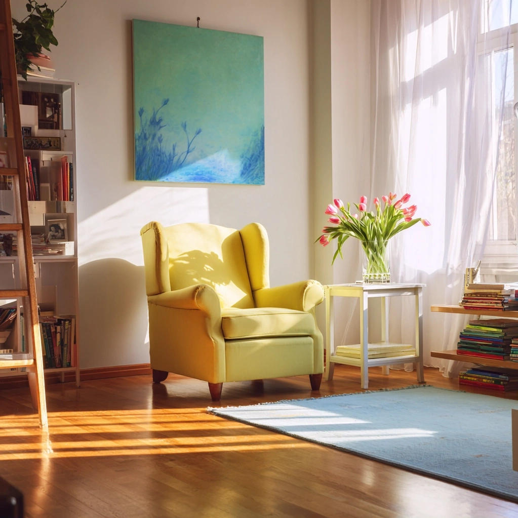
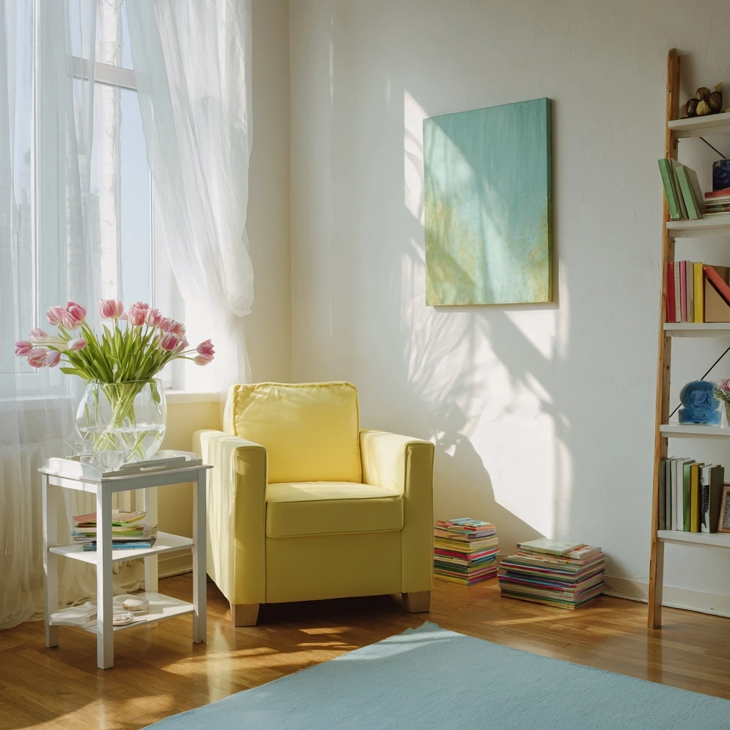
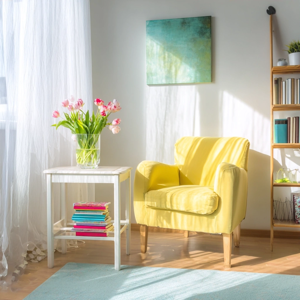
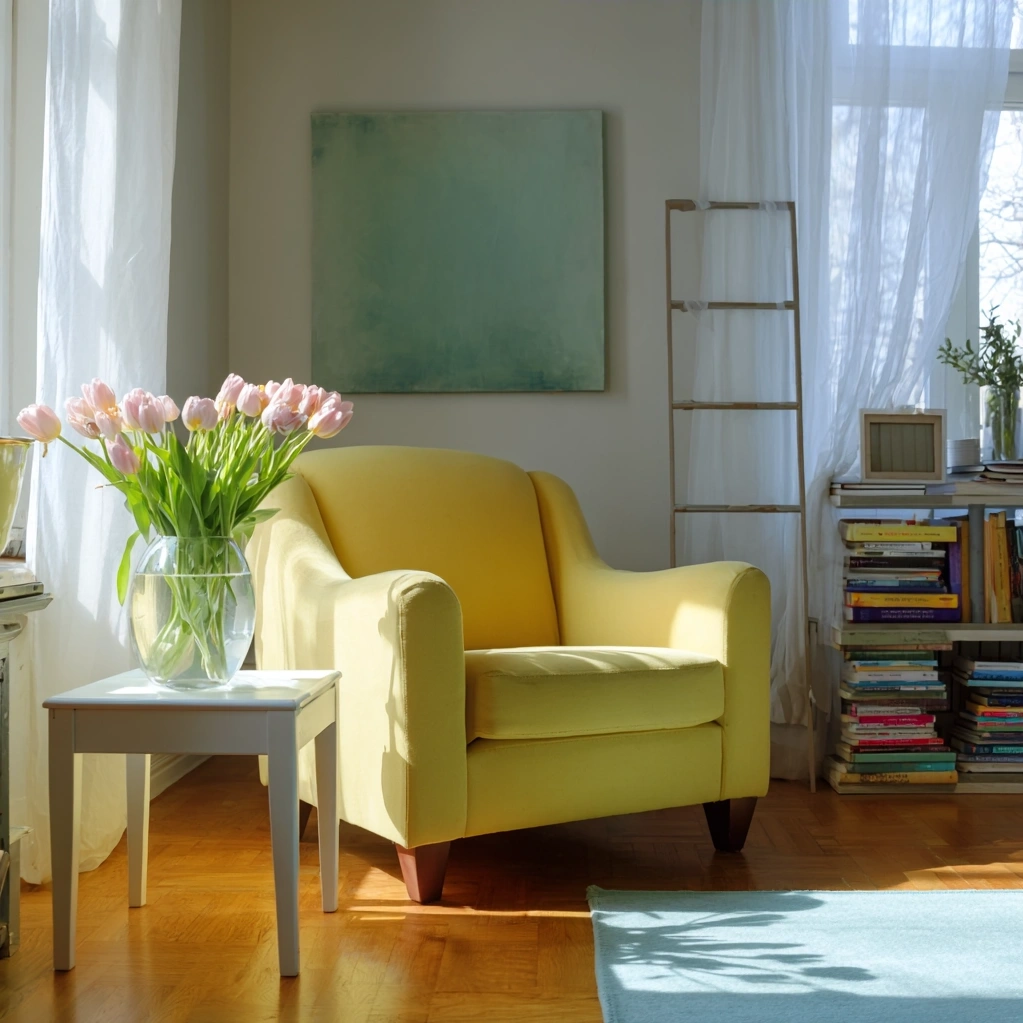
Bright spring colors encompass a range of lively shades that mimic nature's renewal. Think of daffodil yellow, grass green, sky blue, and coral pink—all hues that evoke warmth and energy. These colors work beautifully in various rooms, each offering unique benefits. In living areas, yellows and oranges create a welcoming, sociable atmosphere, perfect for gatherings. For bedrooms, softer brights like mint green or lavender promote relaxation without feeling dull. Kitchens benefit from zesty citrus tones that stimulate appetite and conversation. When selecting your palette, consider the room's natural light: north-facing spaces thrive with warm brights like peach, while south-facing rooms can handle cooler brights like turquoise. Balance is key—pair bright spring colors with neutral bases like white or beige to prevent overwhelm. Use accessories like throw pillows, artwork, or small furniture pieces to introduce color gradually. This approach allows for flexibility and seasonal updates without major renovations.
Bright Spring Colors: Styling Tips for Cohesive Design
Incorporating bright spring colors requires thoughtful styling to achieve a polished look. Start with a focal point, such as a brightly colored sofa or an accent wall, then layer complementary shades around it. For example, pair a teal armchair with mustard yellow cushions and greenery for a harmonious spring feel. Texture plays a crucial role—mix materials like linen, cotton, and wood to add depth and prevent colors from appearing flat. In open-plan spaces, use bright spring colors to define zones: a vibrant rug in the dining area or colorful shelving in a workspace. Don't forget vertical surfaces; paint ceilings or trim in subtle brights to draw the eye upward and enhance spaciousness. For smaller rooms, limit bright colors to one or two elements to avoid crowding. Seasonal decor, like floral arrangements in vivid vases or bright tableware, offers an easy refresh. Remember, bright spring colors should feel intentional, not random. Create flow by repeating shades throughout your home, ensuring a cohesive transition from room to room.
Bright Spring Colors: Practical Applications and DIY Ideas
You don't need a big budget to enjoy bright spring colors—simple DIY projects can make a significant impact. Paint is the most accessible tool; consider updating furniture like dressers or chairs with bold hues. For renters or those avoiding permanent changes, removable wallpaper in floral or geometric bright patterns adds instant charm. Textile projects, such as sewing cushion covers or dyeing curtains, offer customizable options. In kids' rooms, bright spring colors stimulate creativity; try chalkboard walls in vibrant frames or colorful storage bins. Outdoor spaces also benefit—paint garden pots or patio furniture to extend the spring vibe outside. When working with these colors, test samples in different lights to ensure they look good throughout the day. Maintenance matters: choose washable paints and fabrics for high-traffic areas. Bright spring colors can fade over time, so opt for quality products with UV protection if used in sunlit spots. These practical applications make it easy to experiment and find what works best for your lifestyle.
Conclusion
Bright spring colors offer a powerful way to rejuvenate your home, blending aesthetic appeal with psychological benefits. By selecting appropriate palettes, styling with balance, and embracing DIY projects, you can create spaces that feel both fresh and functional. As we move forward, consider how these colors can evolve with the seasons—transitioning bright spring accents into summer with lighter tones or autumn with deeper complements. The key is to stay adaptable, letting your decor reflect your mood and the changing world outside. For lasting impact, focus on quality over quantity, investing in pieces that bring joy year after year. Whether you're making small updates or planning a full makeover, bright spring colors provide a foundation for a home that feels alive and inspiring. Embrace this vibrant renewal, and watch as your spaces transform into havens of positivity and light.
Frequently Asked Questions
Q: What are the best bright spring colors for small spaces?
For small spaces, opt for bright spring colors that enhance light and openness. Soft brights like mint green, pale yellow, or sky blue work well, as they reflect light without overwhelming the room. Use these colors on one accent wall or through accessories like mirrors or lamps to create the illusion of space. Avoid dark brights, which can make areas feel cramped.
Q: How can I incorporate bright spring colors without repainting?
You can easily add bright spring colors without repainting by using textiles and decor. Consider vibrant throw pillows, area rugs, curtains, or artwork in shades like coral or lime green. Seasonal items like vases, table linens, or bookshelf displays also offer quick updates. These elements allow for flexibility and can be changed as your style evolves.
Q: Are bright spring colors suitable for all design styles?
Yes, bright spring colors can adapt to various design styles with careful pairing. For modern spaces, use clean lines and bold brights like orange or teal against neutral backgrounds. In traditional settings, incorporate brights through floral patterns or antique accessories. The key is to balance intensity with your existing decor, ensuring colors complement rather than clash with your style's core elements.