
In our constantly connected world, our phones serve as both lifelines and sources of distraction. The visual clutter on our screens—from busy apps to notification badges—can contribute to mental fatigue without us even realizing it. This is where minimal phone backgrounds come into play, offering more than just aesthetic appeal. These intentionally simple designs create a digital sanctuary that promotes focus and reduces visual noise every time you glance at your device. The importance of curating your phone’s visual environment cannot be overstated. As we spend increasing amounts of time interacting with our screens, the backgrounds we choose directly impact our cognitive load and emotional state. A cluttered screen can feel overwhelming, while a clean, minimalist background provides immediate visual relief. This article explores how embracing minimalism in your phone’s appearance can transform your relationship with technology, creating pockets of calm in your daily digital interactions. Whether you’re seeking to boost productivity, reduce stress, or simply enjoy a more pleasing visual experience, understanding the power of minimal phone backgrounds is the first step toward a more intentional digital life. The right background becomes more than decoration—it becomes a tool for mindfulness in an increasingly noisy world.
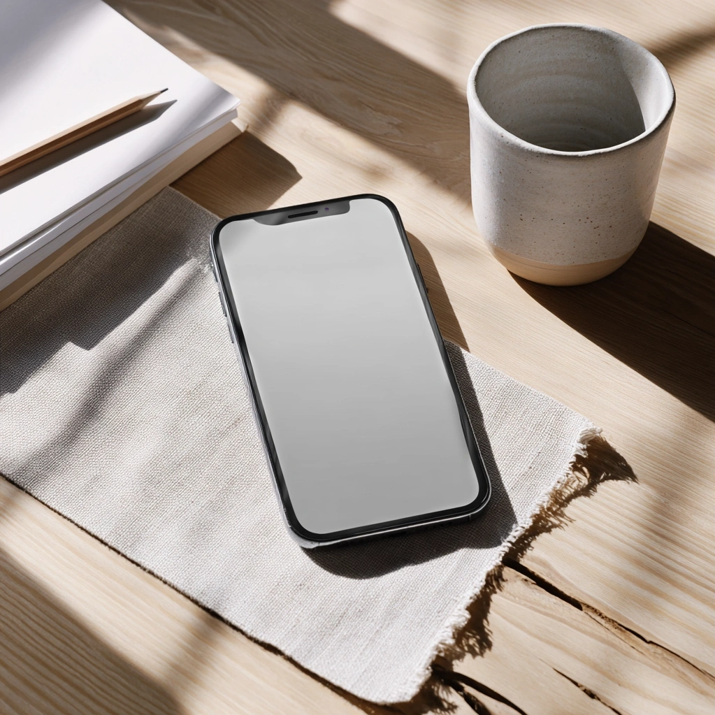
Minimal Phone Backgrounds: Understanding Their Psychological Benefits
Minimal phone backgrounds offer profound psychological advantages that extend far beyond simple aesthetics. When you choose a clean, uncluttered background, you're creating a visual pause in your busy digital life. Research in environmental psychology suggests that simplified visual environments reduce cognitive load, allowing your brain to process information more efficiently. This principle applies directly to your phone screen—the fewer visual distractions present, the easier it becomes to focus on your intended task. Many people report feeling calmer and more centered when their digital spaces reflect intentional simplicity. The absence of visual noise creates mental breathing room, which is particularly valuable in our notification-saturated world. Minimal backgrounds also support better decision-making by reducing the visual stimuli that compete for your attention. When your screen isn't shouting at you with competing colors and patterns, you can approach your phone with greater intention rather than reacting to every visual prompt. This mindful approach to technology use can significantly impact your daily stress levels. The psychological benefits of minimal phone backgrounds become most apparent when you maintain consistency across your devices. A cohesive visual theme reinforces the calming effects, creating a reliable digital environment that supports your mental wellbeing throughout the day.
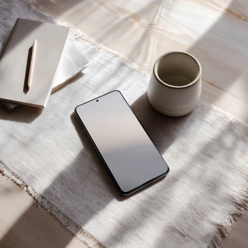
Creating Effective Minimal Phone Backgrounds: Design Principles
Creating effective minimal phone backgrounds requires understanding fundamental design principles that balance simplicity with visual interest. The most successful minimalist backgrounds typically feature limited color palettes—often monochromatic schemes or complementary colors with strong contrast for readability. Typography should be minimal if present at all, with any text serving a clear functional purpose rather than decorative value. Negative space becomes your most powerful tool, providing visual breathing room that enhances both aesthetics and usability. Consider how icons and widgets will interact with your background; the best minimal designs create harmony between foreground elements and the background itself. Many designers recommend starting with solid colors or subtle gradients before introducing texture or pattern. When incorporating imagery, choose photographs with clear focal points and plenty of negative space around the subject. Geometric patterns can work well in minimal phone backgrounds when used sparingly—think single repeating shapes rather than complex tessellations. The placement of visual elements should follow basic composition rules like the rule of thirds, even in minimalist designs. Remember that your background serves as a canvas for your apps and notifications, so it should enhance rather than compete with functional elements. Testing different designs at various times of day can help you identify what works best for your typical usage patterns and lighting conditions.
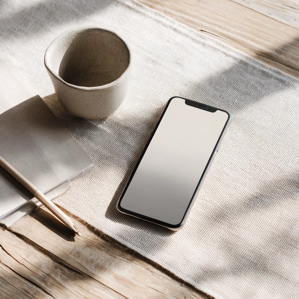
Minimal Phone Backgrounds for Different User Needs
Minimal phone backgrounds can be customized to serve various user needs while maintaining their essential simplicity. For productivity-focused users, backgrounds with subtle grid lines or light organizational elements can enhance workflow without creating visual clutter. These might include faint dot grids that help align icons or barely-visible horizontal lines that create visual structure. Creative professionals might prefer minimal backgrounds featuring inspiring color palettes or abstract shapes that spark imagination without distraction. Meditation and mindfulness practitioners often benefit from backgrounds with natural elements like soft gradients mimicking sky or water, which can serve as visual anchors during brief moments of digital detox. Gamers and entertainment-focused users might choose minimal backgrounds that complement their favorite apps or games, using color schemes that reduce eye strain during extended screen time. Accessibility considerations are crucial—users with visual impairments may need higher contrast minimal backgrounds that maintain simplicity while ensuring screen elements remain clearly visible. Parents might appreciate minimal backgrounds that help children focus on educational apps by reducing competing visual stimuli. The beauty of minimal phone backgrounds lies in their adaptability; they can support diverse lifestyles while consistently providing the core benefits of reduced visual noise and enhanced focus. Experimenting with different approaches allows you to discover what minimalism means for your specific needs and preferences.
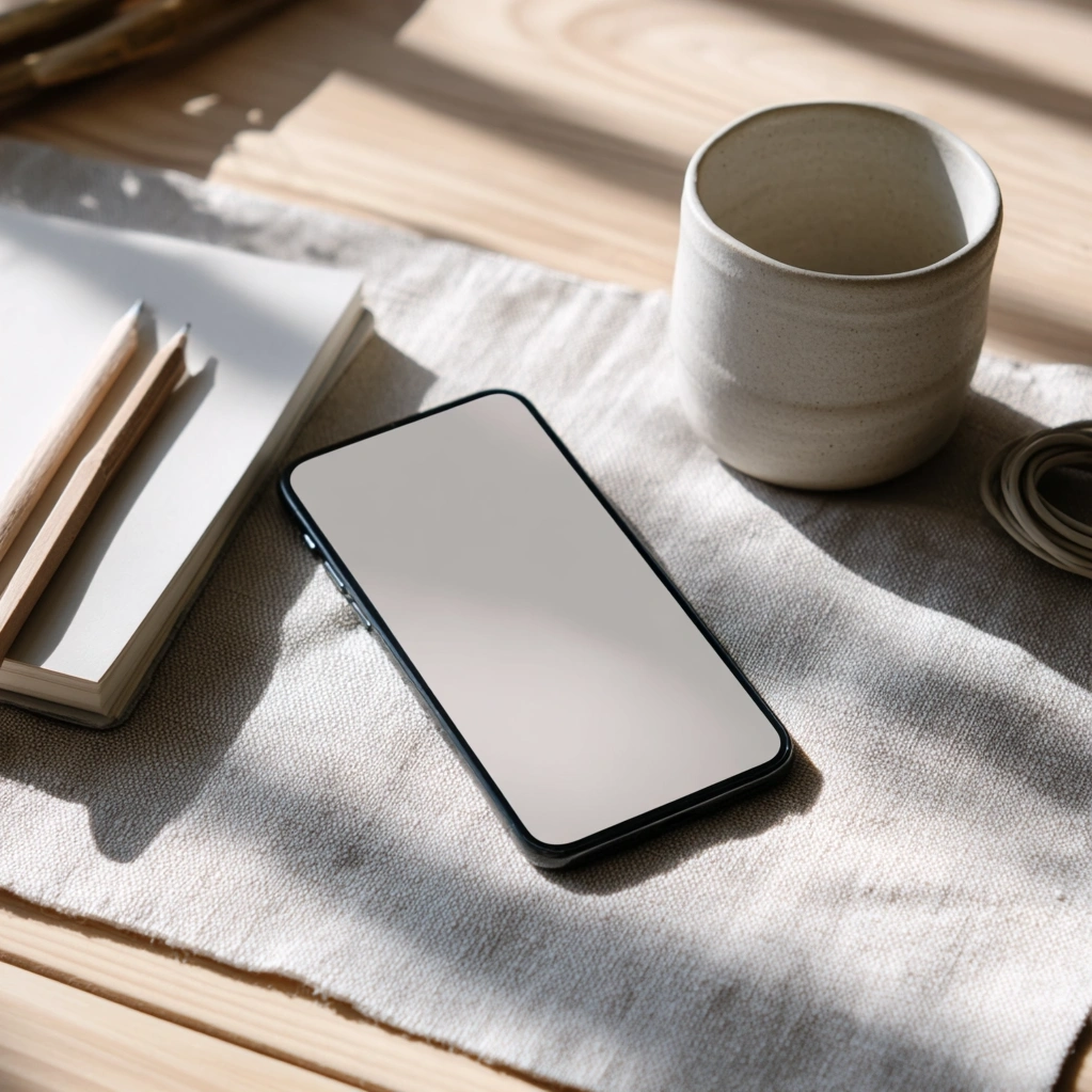
Implementing Minimal Phone Backgrounds Across Devices
Implementing minimal phone backgrounds effectively requires consideration of how they function across different devices and operating systems. iOS and Android handle backgrounds differently, particularly regarding icon placement and widget integration. On iOS, the grid-based icon system benefits from backgrounds with subtle alignment guides, while Android's more flexible layouts might work better with completely uniform designs. Dark mode considerations are essential—minimal backgrounds should be tested in both light and dark themes to ensure readability and visual comfort. For users with multiple devices, creating cohesive minimal backgrounds across phone, tablet, and desktop creates a unified digital environment that reinforces the calming effects of minimalism. Many users find that seasonal variations of their minimal backgrounds help maintain visual interest without sacrificing simplicity—think shifting from cool to warm color palettes as seasons change. Dynamic minimal backgrounds that change subtly throughout the day can provide variety while maintaining clean aesthetics. When implementing minimal phone backgrounds, consider how they interact with your most-used apps; some applications have interface elements that may clash with certain background choices. Testing different resolutions ensures your minimal design remains crisp and effective across various screen sizes and pixel densities. The implementation phase is where theoretical benefits become practical reality, making it worth investing time in finding the perfect minimal background solution for your specific device ecosystem and usage patterns.
Conclusion
Minimal phone backgrounds represent more than a design trend—they're a practical tool for navigating our increasingly digital lives with greater intention and less stress. By embracing simplicity in our most frequently viewed visual spaces, we create pockets of calm that positively impact our focus, productivity, and overall wellbeing. The journey toward effective minimalism isn't about deprivation but rather about intentional curation, selecting visual elements that serve rather than distract. As technology continues to evolve, the principles behind minimal phone backgrounds will become even more valuable. Future developments in screen technology and user interface design may offer new opportunities to integrate minimalism more seamlessly into our digital experiences. The actionable insight from this exploration is simple yet powerful: start today by replacing your current phone background with a minimal alternative. Notice how it affects your interactions with your device over the coming week. Does it reduce the urge to constantly check notifications? Does it make finding apps easier? Does it create moments of visual relief throughout your day? These small observations can guide you toward a more mindful relationship with technology, proving that sometimes the simplest changes create the most profound impacts on our daily lives.
Frequently Asked Questions
Q: How do minimal phone backgrounds improve focus and productivity?
Minimal phone backgrounds reduce visual clutter that competes for your attention, allowing your brain to process information more efficiently. By eliminating distracting patterns and colors, these backgrounds create a calm visual environment that helps you stay focused on your intended tasks. The simplicity reduces cognitive load, making it easier to navigate your phone quickly and intentionally. Many users find they spend less time scrolling mindlessly when their screen presents a clean, purposeful aesthetic.
Q: What are the best color choices for minimal phone backgrounds?
The best color choices depend on your preferences and needs, but generally, neutral tones like soft grays, muted blues, or off-whites work well for most users. High contrast combinations like black and white ensure readability, while monochromatic schemes create cohesion. Consider your typical lighting conditions—darker backgrounds may reduce eye strain in low-light environments, while lighter backgrounds can feel more energizing during daytime use. The key is choosing colors that feel calming to you while providing sufficient contrast for clear icon visibility.
Q: Can minimal phone backgrounds work with widgets and app icons?
Absolutely. Well-designed minimal backgrounds actually enhance widget and icon functionality by providing a clean canvas that makes these elements stand out clearly. The secret is ensuring sufficient contrast between your background and foreground elements. Many users organize their icons into logical groups against minimal backgrounds, creating both visual appeal and practical organization. When using widgets, choose minimal backgrounds with plenty of negative space around widget placement areas to prevent visual competition. The combination can create a highly functional yet aesthetically pleasing interface.