

Imagine walking into a space that instantly calms your mind and uplifts your spirit. This is the magic of a neutral color palette in home decor. Far from being bland or boring, neutral tones create sophisticated, versatile backdrops that allow other elements to shine while promoting a sense of tranquility and balance. Whether you’re decorating a new home or refreshing your current space, understanding how to work with neutrals can transform your living environment into a sanctuary of style and comfort.
Neutral colors—think soft whites, warm beiges, cool grays, and earthy taupes—form the foundation of timeless interior design. They offer incredible flexibility, serving as a canvas that can adapt to changing trends, seasons, and personal preferences. Unlike bold colors that might overwhelm or date quickly, neutrals provide longevity and elegance that grows with you. They work beautifully in any room, from cozy bedrooms to open-plan living areas, creating cohesion and flow throughout your home.
The importance of mastering a neutral color palette extends beyond aesthetics. These colors have psychological benefits, promoting relaxation and reducing visual clutter. In our fast-paced world, homes with neutral palettes become retreats from overstimulation. They also enhance natural light, making spaces feel larger and more inviting. By learning to layer different neutral tones and textures, you can create depth and interest without sacrificing the calming qualities that make these colors so appealing. This approach to decor celebrates simplicity while delivering maximum impact.
Essential Elements of a Versatile Neutral Color Palette
Building a successful neutral color palette begins with understanding its core components. True neutrals include whites, blacks, grays, beiges, and browns, but the real artistry lies in how you combine and layer these tones. Warm neutrals like cream, taupe, and soft browns create cozy, inviting atmospheres, while cool neutrals such as gray, charcoal, and off-white lend a modern, crisp feel. The key is to select a dominant neutral as your base—often a wall color—then incorporate secondary and accent neutrals through furniture, textiles, and accessories.
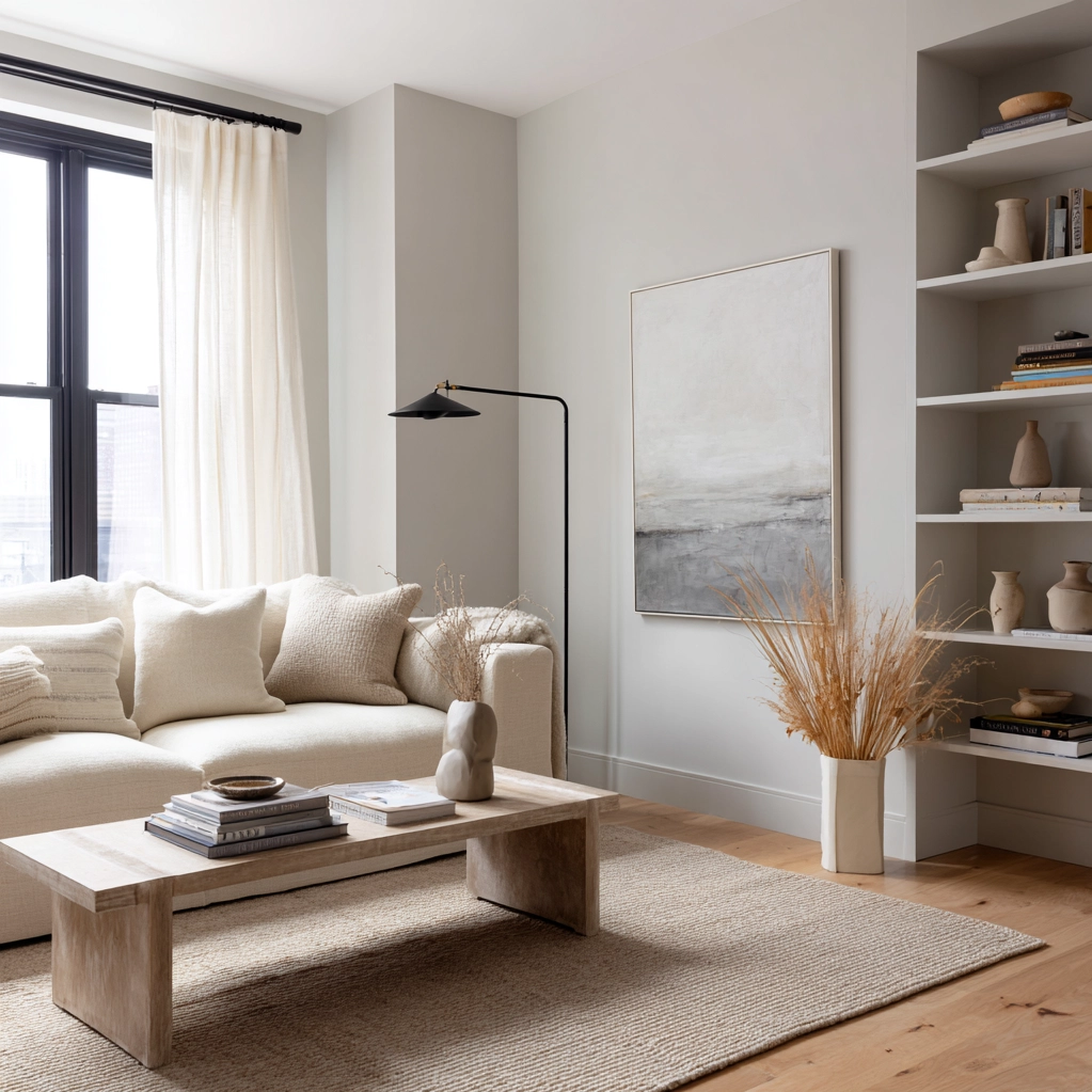
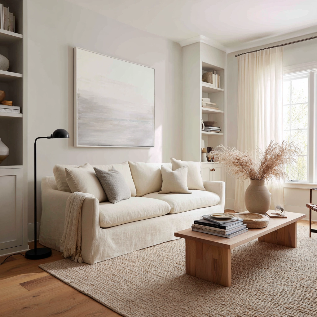
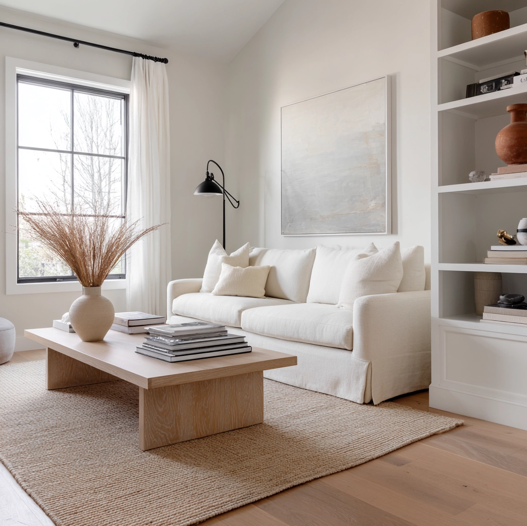
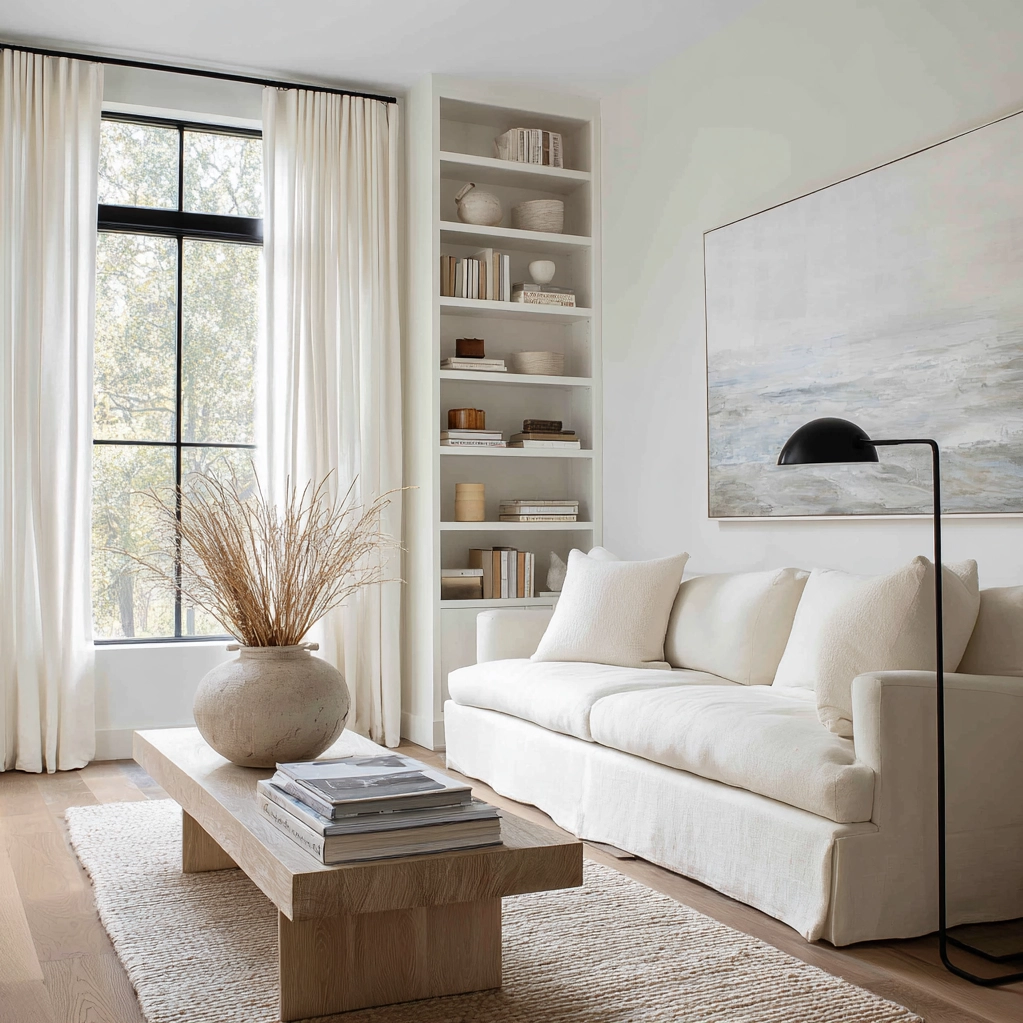
Texture plays a crucial role in preventing neutral spaces from feeling flat or monotonous. Combine different materials like linen, wool, wood, and metal to add visual interest. A smooth leather sofa against a textured wool rug, for example, creates dimension without introducing color. Similarly, varying finishes—matte walls against glossy trim or satin fabrics against rough wood—enhances the richness of your neutral palette. These textural contrasts make the space feel layered and thoughtfully designed rather than stark.
Lighting dramatically affects how neutral colors appear and feel. Natural light reveals the true undertones of your neutrals, while artificial lighting can warm or cool them. Consider the direction your windows face and the quality of light throughout the day when selecting your palette. North-facing rooms benefit from warmer neutrals to counteract cool light, while south-facing spaces can handle cooler tones. Layer lighting with ambient, task, and accent sources to highlight textures and create mood. This attention to light ensures your neutral palette feels dynamic rather than static.
Designing Timeless Rooms with Your Neutral Color Palette
Applying your neutral color palette to specific rooms requires thoughtful planning to maximize both function and beauty. In living rooms, start with a neutral foundation on walls and large furniture pieces. A soft gray or warm beige wall provides the perfect backdrop for a comfortable sofa in a complementary neutral. Add depth with layered textiles—think a cream wool rug, taupe linen curtains, and textured throw pillows in varying shades of ivory and charcoal. These elements create visual interest while maintaining the serene atmosphere that neutrals are known for.
Bedrooms benefit immensely from neutral palettes, as these colors promote relaxation and rest. Consider a calming combination of soft whites and gentle grays for walls and bedding. Layer in natural materials like wood nightstands and a jute rug to add warmth. The absence of bold colors reduces visual stimulation, helping create a peaceful retreat. For those who worry about neutrals feeling too cold, incorporate plush textures like velvet or faux fur in similar tones to enhance coziness without introducing color.
Kitchens and dining areas can also shine with neutral color palettes. White or light gray cabinets provide a clean, timeless look that won't date. Pair with natural wood elements or stone countertops to add warmth and texture. In dining spaces, a neutral backdrop allows beautiful tableware, artwork, or seasonal decorations to take center stage. This flexibility means your space can evolve with different occasions and personal styles while maintaining a cohesive foundation. The result is rooms that feel both sophisticated and welcoming.
Advanced Techniques for Elevating Your Neutral Color Palette
Once you've mastered the basics of a neutral color palette, you can explore advanced techniques that add sophistication and personality to your space. One powerful approach is monochromatic layering—using multiple shades of the same neutral family. For example, combine light, medium, and dark grays throughout a room to create depth and movement. This technique feels cohesive yet dynamic, as the varying tones play off each other beautifully. Add metallic accents in brass, chrome, or bronze to introduce subtle shine without breaking the neutral theme.
Another advanced strategy involves creating focal points within your neutral palette. While the overall scheme remains neutral, you can draw attention to specific areas through texture, pattern, or material contrast. A stone fireplace wall, a woven wall hanging, or a collection of ceramic vases in different neutral glazes can serve as visual anchors. These elements add interest without relying on color, maintaining the palette's calming effect while preventing monotony.
Seasonal adaptation is where neutral color palettes truly shine. Unlike colorful schemes that might clash with seasonal decorations, neutrals provide the perfect backdrop for rotating accents. In spring, add fresh greenery and light linens; in autumn, incorporate deeper textures and natural elements like pinecones or dried branches. Your base remains constant, creating a sense of stability, while seasonal touches keep the space feeling fresh and connected to the changing world outside. This adaptability makes neutral palettes both practical and enduring.
Conclusion
Embracing a neutral color palette is more than a design choice—it's an investment in creating a home that feels both timeless and personally meaningful. Throughout this exploration, we've seen how neutrals provide the foundation for versatile, calming spaces that adapt to your life rather than dictating it. From understanding the essential elements to applying advanced layering techniques, a neutral approach offers endless possibilities for expressing your style while maintaining serenity.
As you move forward with your decor journey, remember that the beauty of neutrals lies in their subtlety and sophistication. They create spaces that feel intentionally designed yet effortlessly comfortable. Whether you're starting fresh or refreshing existing rooms, a neutral palette gives you the freedom to evolve your style over time without major overhauls. It allows architectural details, cherished objects, and natural light to shine, putting the focus on quality and comfort rather than fleeting trends.
Looking ahead, consider how your neutral foundation can grow with you. Perhaps you'll introduce subtle pattern through textiles, or maybe you'll experiment with different material combinations. The flexibility of this approach means your home can reflect changes in your life while maintaining its essential character. Start with confidence, knowing that a well-executed neutral color palette creates not just beautiful rooms, but a sanctuary that welcomes you home day after day.
Frequently Asked Questions
Q: Can a neutral color palette work in small spaces without making them feel cramped?
Absolutely! In fact, neutral color palettes are excellent for small spaces. Light neutrals like soft whites, pale grays, and warm beiges can make rooms feel larger and more open by reflecting natural light. The key is to maintain consistency—using similar tones throughout creates visual continuity that expands the perceived space. Avoid too many contrasting dark neutrals in small areas, and instead focus on light-to-medium tones with texture for interest. Mirrors and strategic lighting further enhance the airy feel.
Q: How do I prevent my neutral decor from looking too bland or boring?
The secret to vibrant neutral spaces lies in texture, material variety, and subtle contrast. Combine different fabrics like linen, wool, velvet, and leather in similar tones. Incorporate natural elements such as wood, stone, and plants to add organic warmth. Vary finishes from matte to glossy, and include metallic accents in brass or chrome for shine. Architectural details like molding or interesting light fixtures also break up monotony. Remember, neutrals provide the backdrop—your furniture shapes, artwork, and personal collections add the personality.
Q: What's the best way to add color to a neutral color palette without overwhelming it?
When working with a neutral foundation, you can introduce color strategically through accessories that are easy to change. Think throw pillows, blankets, artwork, vases, or small decorative objects in muted, earthy tones that complement your neutrals. Soft greens, dusty blues, or terracotta work beautifully. Keep colored items to about 10-20% of the visual space to maintain the neutral feel. This approach lets you experiment with color trends seasonally without committing to permanent changes. The neutral base ensures everything coordinates harmoniously.