
As winter fades and nature awakens, there’s something undeniably magical about the gentle arrival of pastel spring colors in our living spaces. These soft, delicate hues do more than just brighten a room—they transform the very atmosphere of our homes, creating environments that feel fresh, rejuvenating, and full of possibility. The importance of embracing these seasonal palettes extends beyond mere aesthetics; it’s about connecting our indoor environments to the natural world’s renewal cycle, fostering spaces that support both relaxation and creativity. When we incorporate pastel spring colors into our decor, we’re not just following a trend—we’re creating sanctuaries that reflect the optimism and lightness of the season. These colors have psychological benefits too, with soft blues promoting calm, gentle greens encouraging harmony, and pale pinks evoking warmth and comfort. The transition from winter’s darker tones to spring’s lighter palette represents more than a color change; it symbolizes new beginnings and fresh perspectives in our homes. Whether you’re planning a complete redesign or simply looking to refresh a single room, understanding how to work with these hues can help you create spaces that feel both timeless and perfectly in tune with the season. Pastel spring colors offer a versatile foundation that works with various styles, from modern minimalist to cozy traditional, making them accessible to everyone looking to bring the spirit of spring indoors. As we explore these colors together, you’ll discover how even small touches can create significant impact, transforming your home into a springtime haven that welcomes both you and your guests with open arms.
Pastel Spring Colors That Will Transform Your Living Room
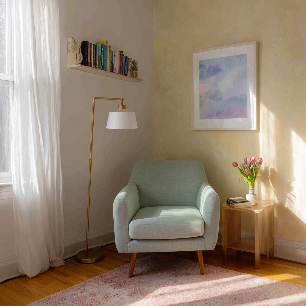
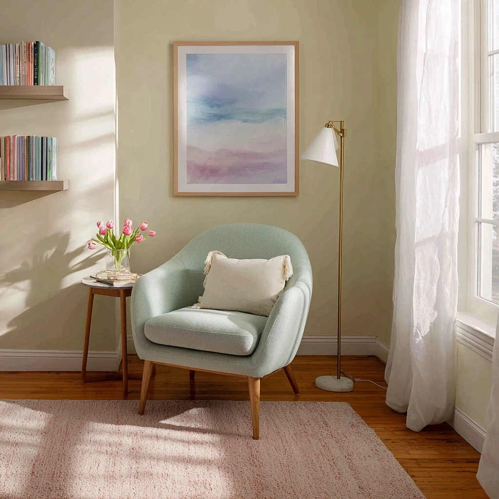
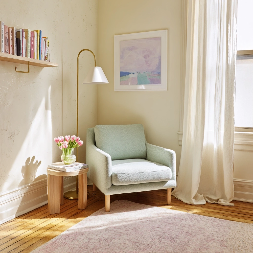
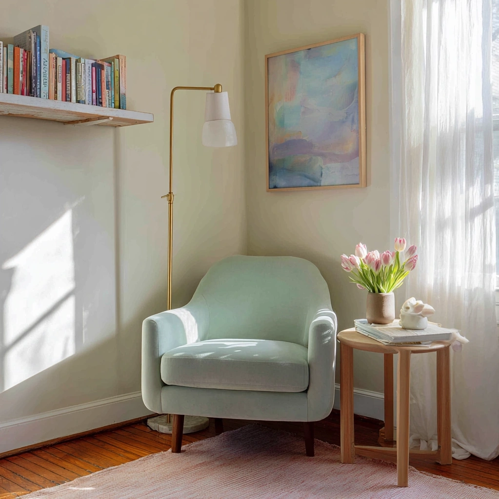
The living room serves as the heart of the home, and incorporating pastel spring colors here can create an inviting space that balances relaxation with sophistication. Soft mint green walls provide a refreshing backdrop that complements both neutral furniture and bold accent pieces, creating a versatile foundation for any decor style. Pair this with pale lavender throw pillows and a blush pink area rug to add layers of color without overwhelming the senses. When working with pastel spring colors in larger spaces, consider using them in combination with natural materials like light wood furniture and woven textiles to enhance the seasonal feel. The key is balance—mix these soft hues with crisp whites and warm neutrals to prevent the space from feeling too saccharine. For furniture, opt for pieces in light gray or beige upholstery, then add pastel accessories that can be easily swapped as seasons change. Window treatments in sheer fabrics in soft blue or buttery yellow can filter light beautifully, creating a gentle, diffused glow throughout the day. Don't forget vertical spaces—a gallery wall with frames in various pastel shades adds visual interest while maintaining the light, airy feel. Pastel spring colors work particularly well in living rooms because they create an atmosphere that's both calming and uplifting, perfect for both quiet evenings and social gatherings. By strategically placing these colors throughout the room, you create a cohesive look that feels intentional rather than haphazard. Remember that lighting plays a crucial role in how these colors appear—natural light enhances their softness, while warm artificial lighting can deepen their warmth. With careful planning, your living room can become a springtime sanctuary that welcomes both family and guests with its gentle, inviting palette.
Incorporating Pastel Spring Colors in Bedroom Design
Bedrooms benefit tremendously from the soothing qualities of pastel spring colors, creating personal retreats that promote rest and rejuvenation. Soft powder blue bedding sets a tranquil foundation, while accent walls in pale sage green add depth without overwhelming the space. When selecting pastel spring colors for sleep spaces, consider their psychological effects—soft blues and lavenders are particularly effective for promoting relaxation and better sleep quality. Layer different shades within the same color family for added dimension, such as pairing a light peach duvet cover with slightly deeper coral-toned pillows. Window treatments in sheer fabrics dyed in soft pastel hues can create beautiful light patterns throughout the day while maintaining privacy. For furniture, consider painted pieces in muted pastel tones rather than staining them darker—a pale yellow dresser or lavender nightstand can become beautiful focal points. Textural elements like a chunky knit throw in baby pink or a velvet headboard in soft mint add tactile interest while maintaining the color scheme. Pastel spring colors work exceptionally well in bedrooms because they create a sense of sanctuary, separating the sleep space from the more vibrant areas of the home. Consider incorporating these colors through artwork featuring spring landscapes or abstract pieces in coordinating palettes. For smaller bedrooms, using pastels on walls can actually make the space feel larger and airier than dark or bright colors would. Storage solutions like baskets in natural materials with pastel liners keep clutter organized while contributing to the overall aesthetic. The beauty of using pastel spring colors in bedroom design lies in their versatility—they work equally well in children's rooms, guest bedrooms, and master suites, adapting to different needs while maintaining their calming properties. By creating a cohesive color story throughout the space, you establish a restful environment that supports both sleep and morning routines.
Creative Ways to Use Pastel Spring Colors in Small Spaces
Small spaces present unique opportunities for experimenting with pastel spring colors, as these hues can visually expand areas while adding personality without overwhelming. Entryways benefit from a soft buttery yellow on walls or doors, creating an immediately welcoming atmosphere that sets the tone for the entire home. In bathrooms, pale aqua tiles or vanity cabinets in mint green transform functional spaces into spa-like retreats that feel fresh and clean. Pastel spring colors work particularly well in compact areas because they reflect light effectively, making rooms feel larger and brighter than they actually are. For kitchen nooks or breakfast corners, consider painting just the ceiling in a soft peach tone—this unexpected use of color draws the eye upward and creates a cozy, intimate feeling. Open shelving displaying dishes in coordinating pastel shades adds both storage and decorative elements without consuming valuable floor space. When working with pastel spring colors in small areas, consistency is key—using the same palette throughout creates flow and makes spaces feel more connected. Vertical stripes in alternating pastel shades can cleverly heighten low ceilings, while horizontal applications can widen narrow hallways. Don't neglect often-overlooked areas like closet interiors or pantry doors—a coat of pale lavender inside a linen closet or soft blue on pantry shelves adds delightful surprises that enhance daily routines. Pastel spring colors can also unify multi-functional spaces; in studio apartments, using the same three pastel hues throughout different zones creates visual harmony while defining separate areas. For renters or those not ready for permanent changes, removable wallpaper in pastel patterns or decals in soft shapes offer flexible ways to incorporate these colors. The strategic use of pastel spring colors in small spaces proves that impactful design isn't about square footage but about thoughtful color application that enhances both function and mood.
Mixing Pastel Spring Colors with Other Design Elements
Successfully integrating pastel spring colors into your home involves understanding how they interact with other design elements to create balanced, sophisticated spaces. These soft hues pair beautifully with natural materials—think light oak furniture against pale green walls, or rattan accessories complemented by soft blue textiles. Metallic accents in brushed brass or polished nickel add necessary contrast to pastel palettes, preventing them from feeling too sweet or juvenile. When combining pastel spring colors with patterns, opt for small-scale designs in coordinating shades rather than bold contrasts that might overwhelm the delicate hues. Textural variety becomes particularly important with pastel schemes; mix matte and glossy finishes, smooth and rough surfaces to create visual interest that color alone cannot provide. Pastel spring colors work exceptionally well with architectural details—painting trim and moldings in slightly deeper tones of the same color family adds dimension without introducing competing hues. For flooring, light natural wood tones or pale gray tiles provide neutral foundations that allow pastel walls and furnishings to shine. Window treatments should complement rather than compete with pastel walls—sheer curtains in similar tones maintain the airy feel while providing privacy. Lighting fixtures in clear glass or light metals distribute illumination evenly across pastel surfaces, enhancing their soft glow throughout the day. When accessorizing with pastel spring colors, consider the rule of three—grouping items in odd numbers creates more dynamic displays than even pairings. Seasonal transitions become seamless with pastel foundations; simply swap out accessories for deeper tones in fall or brighter accents in summer while maintaining the core color scheme. The true artistry of working with pastel spring colors lies in understanding their relationships with other elements, creating spaces that feel both current and timeless through thoughtful combinations rather than trends alone.
Conclusion
Embracing pastel spring colors in your home represents more than a seasonal update—it's an investment in creating spaces that nurture well-being and reflect the optimism of new beginnings. Throughout this exploration, we've seen how these gentle hues transform living rooms into inviting gathering spaces, bedrooms into restorative sanctuaries, and even small areas into thoughtfully designed environments. The versatility of pastel spring colors lies in their ability to work across various styles and spaces, from traditional to contemporary, proving that soft doesn't mean simplistic. As you move forward with incorporating these colors into your home, remember that successful implementation comes from balance—mixing pastels with natural materials, metallic accents, and varied textures to create depth and interest. The future of home design continues to embrace colors that support mental and emotional well-being, making pastel palettes increasingly relevant beyond seasonal trends. Looking ahead, consider how these colors might evolve in your space; perhaps starting with accent pieces this spring, then gradually incorporating them into larger elements as you gain confidence. The true beauty of pastel spring colors lies in their transformative power—their ability to refresh not just rooms, but moods and mindsets. As seasons change and years pass, these soft hues provide a timeless foundation that can adapt to evolving tastes while maintaining their calming, uplifting qualities. Whether you're making dramatic changes or subtle updates, pastel spring colors offer a pathway to creating homes that feel both beautiful and authentically yours, spaces that welcome each day with gentle optimism and quiet elegance.
Frequently Asked Questions
Q: What are the best pastel spring colors for north-facing rooms?
North-facing rooms receive cooler, indirect light that can make spaces feel chilly. To counteract this, choose warmer pastel spring colors like soft peach, buttery yellow, or pale coral. These hues add warmth without overwhelming the space. Avoid cooler pastels like mint green or powder blue in north-facing rooms, as they can enhance the cool light effect. Instead, use these cooler tones as accents through accessories that can be easily changed. For walls, consider warm off-whites with subtle pastel undertones that reflect available light while adding warmth. Test samples at different times of day before committing to ensure the color works with your specific lighting conditions.
Q: How can I incorporate pastel spring colors without making my home look too childish?
The key to sophisticated pastel spring colors lies in balance and context. Pair soft hues with mature materials like natural wood, stone, and metals to ground the palette. Choose sophisticated pastel shades—think dusty rose rather than bubblegum pink, or sage green instead of lime. Use pastels in unexpected ways, like on ceilings, inside bookshelves, or on architectural details rather than entire walls. Limit the number of pastel colors in a room to two or three, and use them in combination with plenty of neutrals. Opt for textured finishes over flat paint, and incorporate patterns with pastel accents rather than solid blocks of color. Furniture in rich fabrics like velvet or linen in pastel tones reads as more sophisticated than shiny or synthetic materials.
Q: Can pastel spring colors work in modern minimalist designs?
Absolutely! Pastel spring colors can enhance modern minimalist spaces by adding subtle warmth and depth without clutter. In minimalist designs, use pastels as monochromatic schemes—varying shades of a single pastel color throughout a room creates calm, cohesive spaces. Apply pastels to large, clean surfaces like walls or built-in cabinetry rather than small accessories. Choose pastel spring colors with gray undertones for a more contemporary feel, like greige-based pastels rather than pure hues. Incorporate pastels through quality materials—concrete with pastel pigment, pastel-toned marble, or stained wood in pale finishes. The minimalist approach benefits from pastel's ability to define spaces without visual noise, creating serene environments that feel both modern and welcoming.